| 要約: | ここでは、テキストやグラフィックスを扱う場合に役立つ項目をいくつか挙げてみます。 |
Curl® 言語には、グラフィカル オブジェクトをテキストと組み合わせる方法が多数あります。このセクションでは、テキストとグラフィックスを一緒に処理するために使用するいくつかのツールについて説明します。これには、テキストフロー ボックス、フォント、カーソルおよびツール ヒントが含まれます。
グラフィカル オブジェクトは、すべてのグラフィカル コンテナ内で、書式が設定されていないテキスト文字列、および、高度に設定されたテキストの両方を自由に組み合わせられます。テキストのみの表示については、「
テキスト書式」の章で説明されている、テキスト、段落、および、表テキスト書式とプロシージャを使用するだけで通常はで十分です。
ただし、ボタンやメニュー上、さらに表やキャンバス内、ポップアップ ダイアログおよびドロップダウン リスト内で、グラフィックスと多少のテキストが混在するような場合は、テキスト文字列またはテキスト書式をグラフィック階層に追加すればよく、特別のテキスト コンテナの配置に頭を悩ませることもありません。
ユーザーとの対話やアプレット内の操作に反応して変更する必要のあるテキストを作成する場合、テキストを追加、削除、置換、また状況によっては分割するためのメソッドが必要です。このような状況において、
text-part プロシージャは効果的で使いやすいツールです。
text-part は書式設定されたテキストを表すテキスト プロシージャで、
Visual を必ず返します。これにより、テキストは
Visual.add、
Visual.clear のような便利な
Visual メソッドを呼び出すことができます。
これらのメソッドによって、レイアウトの分裂や書式設定の心配をせずに、
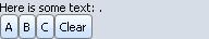
すでに表示されているテキストを簡単に変更することができます。次の例では、
text-part の追加と消去メソッドを使用しています。
A、
B および
C
のボタンは text-part に単語を追加し、
Clear ボタンは空にします。
テキスト変更で必要なのは、これらの操作だけです。
| 例:
グラフィカル オブジェクト内のテキストの変更 |
 |
{let tp:Visual = {text-part}}
{Dialog
    {VBox width=2in,
        {text Here is some text: {value tp}.},
        {HBox
            {CommandButton
                label="A",
                {on Action do
                    {tp.add " Alpha"}
                }
            },
            {CommandButton
                label="B",
                {on Action do
                    {tp.add " Bravo"}
                }
            },
            {CommandButton
                label="C",
                {on Action do
                    {tp.add " Charlie"}
                }
            },
            {CommandButton
                label="Clear",
                {on Action do
                    {tp.clear}
                }
            }
        }
    }
}
| |
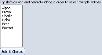
次の例では、text-part を使用して、英語の複数と単数の区別を正確に反映するラベルを作成します。text-part は、"s" を、ボタン中の単語 "choice" の後に適宜に追加するために使用されています。( [Submit Choice]-->[Submit Choices] )
| 例:
ボタン ラベル上の微妙なテキスト変更 |
 |
{let tp-plural:Visual =
    {text-part s}
}
{let submit:CommandButton =
    {CommandButton
        label =
            {text Submit Choice{value tp-plural}}}
}
{let lb:ListBox =
    {ListBox width=2cm,
        "Alpha",
        "Bravo",
        "Charlie",
        "Delta",
        "Echo",
        "Foxtrot",
        {on ValueChanged do
            {tp-plural.clear}
            {if lb.value.size != 1 then
                {tp-plural.add "s"}
            }
        }

    }
}
{Dialog
    {VBox
        {text Try shift-clicking and control-clicking in order to select
            multiple entries.},
        lb,
        submit
    }
}
| |
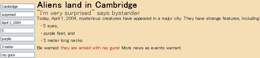
次の例では、text-part のコンテキストに対しての対応を示します。新聞記事の text-part には常に text-field のコンテンツが反映されます。text-part は、大きいフォント、太字、箇条書き、または赤に変えるなど、コンテキストに合わせて正確にレンダリングされます。記事のテキストを選択してみてください。text-part とその周辺のテキストに違いはありません。
| 例:
周囲の書式との対応 |
 |
{define-proc public {linked-text-field tp:Visual, value:String}:TextField
    let text-field =
        {TextField width=3cm, value=value,
            {on ValueChanged at tf:TextField do
                {tp.clear}
                {tp.add tf.value}
            }
        }
    {tp.add text-field.value}
    {return text-field}
}

{let city:Visual = {text-part}}
{let emotion:Visual = {text-part}}
{let date:Visual = {text-part}}
{let number:Visual = {text-part}}
{let color:Visual = {text-part}}
{let distance:Visual = {text-part}}
{let weapons:Visual = {text-part}}

{let city-text-field:TextField = {linked-text-field city, "Cambridge"}}
{let emotion-text-field:TextField = {linked-text-field emotion, "surprised"}}
{let date-text-field:TextField = {linked-text-field date, "April 1, 2004"}}
{let number-text-field:TextField = {linked-text-field number, "5"}}
{let color-text-field:TextField = {linked-text-field color, "purple"}}
{let distance-text-field:TextField = {linked-text-field distance, "3 meter"}}
{let weapons-text-field:TextField = {linked-text-field weapons, "ray guns"}}

{let story:Visual =
    {paragraph
        {huge {bold Aliens land in {value city}}}{br}
        {big {quote I'm very {value emotion}} says bystander}{br}
        Today, {value date}, mysterious creatures have appeared in a
        major city.  They have strange features, including:
        {itemize
            {item {value number} eyes, }
            {item {value color} feet, and}
            {item {value distance} long necks.}
        }{br}
        Be warned: {text color="red", they are armed with {value weapons}!}
        More news as events warrant.
    }
}

{Frame background="wheat",
    {spaced-hbox
        {Dialog
            {spaced-vbox
                city-text-field,
                emotion-text-field,
                date-text-field,
                number-text-field,
                color-text-field,
                distance-text-field,
                weapons-text-field
            }},
        {value story}
    }
}
| |
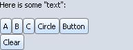
最後に、Curl 言語の他のテキスト部分と同様に、text-part には各種の可視オブジェクトを含めることができます。最初の例を発展させた次の例では、書式設定されたテキストやシェイプ、さらに text-part へのコントロールが追加できるようになっています。
| 例:
グラフィカル オブジェクトを追加する text-part の使用 |
 |
{let tp:Visual =
    {text-part}
}
{Dialog
    {VBox width=2in,
        {text Here is some "text": {value tp}},
        {Fill height=10pt},
        {HBox
            {CommandButton
                label="A",
                {on Action do
                    {tp.add " "}
                    {tp.add {bold Alpha}}
                }
            },
            {CommandButton
                label="B",
                {on Action do
                    {tp.add " "}
                    {tp.add {text color="blue", Bravo}}
                }
            },
            {CommandButton
                label="C",
                {on Action do
                    {tp.add " "}
                    {tp.add {text Charlie{superscript 2}}}
                }
            },
            {CommandButton
                label="Circle",
                {on Action do
                    {tp.add " "}
                    {tp.add
                        {EllipseGraphic width=10pt, height=10pt}
                    }
                }
            },
            {CommandButton
                label="Button",
                {on Action do
                    {tp.add " "}
                    {tp.add
                        {CommandButton
                            label="Echo",
                            {on Action do
                                {popup-message
                                    "Yes, it's a functional button."
                                }
                            }
                        }
                    }
                }
            }
        },
        {CommandButton
            label="Clear",
            {on Action do
                {tp.clear}
            }
        }
    }
}
| |
add メソッドを使用して要素を text-part に追加する場合、改行方法は要素間に加える空白によって決定されます。次のルールは、Curl 言語で書かれたアプレットにあるすべてのテキストに適用されます。
- 1 つの空白文字 (" ") で構成されている String、または別の String にある空白は、2 つの文字の間にある場合は削除されません。このような空白での改行は可能です。
- エスケープ文字 (\ ) は、不可視文字のように動作します。エスケープされた空白は、行にいくつか含まれていてもそこで折り返されません。2 つの単語の間にエスケープされた空白文字を置いた場合、それらの単語は結合され、単語間で改行されません。
次の例では、text-part を使用して、結合したテキストに空白を加えるさまざまな方法を示します。ウィンドウの幅を変更して、各改行方法を確認してください。
| 例:
text-part にあるテキスト間への空白の追加 |
 |
{define-proc {space-will-collapse}:Visual
    let tp:Visual={text-part}

    ||The string below has a trailing space.
    ||It will be collapsed.

    {tp.add {text I have an octogenarian }}
    {tp.add {text grandparent.}}
    {return tp}
}

{define-proc {breaking-space}:Visual
    let tp:Visual={text-part}

    ||The first string below ends with no space.

    {tp.add {text I have an octogenarian}}

    ||The second string consists of one space.

    {tp.add " "}
    {tp.add {text grandparent.}}
    {return tp}
}

{define-proc {non-breaking-space}:Visual
    let tp:Visual={text-part}

    ||The string below ends with an escaped space.

    {tp.add {text I have an octogenarian\ }}
    {tp.add {text grandparent.}}
    {return tp}
}

{CommandButton
    label = "Show me the example.",
    {on Action do
        {let view:View =
            {View
                {spaced-vbox
                    width = 7cm,
                    height = 4cm,
                    {space-will-collapse},
                    {breaking-space},
                    {non-breaking-space}
                }
            }
        }
        {view.show}
    }
}
| |
Curl 言語では、オプションを使用してすべてのグラフィカル オブジェクトにおけるテキストの表示を変更できます。たとえば、ボタン ラベルまたはタイトル バーにあるテキストの表示方法は既定の表示設定から変更できます。テキスト文字列にオプションを直接指定するには、単に引用符付き文字列を使用するのではなく、オプションを {text ...} といったテキスト書式に含める必要があります。
テキストに適用されているグラフィック オプションを以下に示します。これらのオプションをキーワード引数の形式に設定します。これらのオプションの詳細説明および実行中のテキストへの影響は「
テキスト書式」の章に記載されています。また、オプションの既定値 (ある場合) については『API リファレンス』の説明も参照してください。
- font-family :フォント書体のコンマ区切りリストを含む文字列、またはコンマのない単一のフォント書体名を含む文字列。有効値は次のとおりです。
- "serif"
- "sans-serif"
- "monospace"
- Curl® 実行環境で実行されるシステム上にある各フォント
- font-size :数量として指定されたテキストの実際のサイズ。単位が指定されていない場合、Curl 言語はポイント単位 pt を使用します。
- font-weight :テキストを太字にするかどうかを指定します。有効値は "normal" と "bold" です。
- font-style :テキストをイタリック体にするかどうかを指定します。有効値は "normal" と "italic" です。
- color :テキストの色。有効値と形式の詳細は、「色関連のオプションについて」および「塗りつぶしパターンとテクスチャ」を参照してください。
次の例では、テキスト オブジェクトの表示を変更する方法を示します。左にある
VBox のテキスト オブジェクトは既定のオプション バインディングを使用します。中央にある
VBox のテキスト オブジェクトは同じオプション バインディングに設定されます。右にある
VBox の上のテキスト オブジェクトは既定のオプションを使用し、下のテキスト オブジェクトのオプションは他の値に設定されます。
| 例:
さまざまなテキスト書式 |
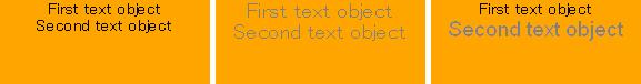 |
{spaced-hbox
    valign="bottom",
    {VBox width=5cm,
        height=2cm,
        halign="center",
        background="orange",
        "First text object",
        "Second text object"
    },

    || Modify color, font-family, and font-size of
    || both text elements in VBox
    {VBox width=5cm,
        height=2cm,
        halign="center",
        background="orange",
        color="gray",
        font-family="sans-serif",
        font-size=14,
        "First text object",
        "Second text object"
    },

    || Modify color, font-family, and font-size of
    || second text element only
    {VBox width=5cm,
        height=2cm,
        halign="center",
        background="orange",
        "First text object",
        {text color="gray",
            font-family="arial, verdana, sans-serif",
            font-size=14,
            Second text object}
    }
}
| |
text などのテキスト書式の使用方法については、「
テキスト書式」の章で、各種テキストの使用法の一覧、説明および使用例が掲載されています。
Cursor クラスはカーソルのインターフェースとしての機能を果たす抽象クラスです。サブクラスは様々なカーソルのシェイプを表示します。
Visual.cursor オプションを各グラフィカル オブジェクトに設定して
Cursor オブジェクトを使用します。これにより、カーソルをグラフィカル オブジェクトの上に置くとその外観が変わります。
カーソルを次のリストにある定数の上に置き、その定数が表すカーソルを確認してください。また、定数をクリックして『API リファレンス マニュアル』で各項目を参照してください。
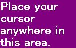
次に簡単な例を示します。カーソルを
HBox 中で動かすと、砂時計に変わります。
| 例:
代替カーソルの使用 |
 |
{HBox background="purple",
    width=4cm,
    || Set the cursor option
    cursor=cursor-wait,
    color="white",
    font-size=18pt,
    font-weight="bold",
    font-family="sans-serif",
    "Place your cursor anywhere in this area."
}
| |
以下の例では、独自にカーソルを作成する方法を示します。
Cursor.create#factory ファクトリは、
Map-of CursorColorを取ります。 例では、プロシージャ
cursor-from-string を定義します。このプロシージャは、ピクセル色を文字で示す文字列
open-hand-string からのマップを生成します。
- '.' は透明を示します
- '1' は黒色を示します
- '2' は白色を示します
以下の図では、文字列が示す絵のピクセル色を表示します。
各四角は一つのピクセルを意味します。手形の外のピクセルは透明で、手形の中のピクセルは白色となっています。
| 例:
独自手形カーソルの作成 |
 |
{import * from CURL.DEVICE.CURSOR}

|| The hotspot of our cursor.
{let constant package open-hand-hotspot-x:int = 7}
{let constant package open-hand-hotspot-y:int = 0}

|| The Cursor.create method takes a {Map-of CursorColor}.
|| We will generate it by using the following string of
|| width and height equal to 16. See the cursor-from-string
|| proc to see how we generate this Map.
{let constant package open-hand-string:String =
    ".......11......." &
    "...11.122111...." &
    "..12211221221..." &
    "..12211221221.1." &
    "...1221221221121" &
    "...1221221221221" &
    ".11.122222221221" &
    "1221122222222221" &
    "122212222222221." &
    ".12222222222221." &
    "..1222222222221." &
    "..122222222221.." &
    "...12222222221.." &
    "....122222221..." &
    ".....12222221..." &
    ".....12222221..."
}

{define-proc public {cursor-from-string
                        cursor-string:String,
                        width:int,
                        height:int,
                        hotspot-x:int,
                        hotspot-y:int
                    }:Cursor

    {assert cursor-string.size == width * height}

    let map:{Map-of CursorColor} =
        {new {Map-of CursorColor}, width, height}

    {for-pixel p at x, y no-read in map do
        let ch:char = cursor-string[y * width + x]
        set p =
            {switch ch
             case '1' do CursorColor.black
             case '2' do CursorColor.white
             case '.' do CursorColor.transparent
             else {error "cursor-from-string: Not a valid character."}
            }
    }

    {return
        {Cursor.create
            map,
            hotspot-x,
            hotspot-y
        }
    }
}

{let open-hand-cursor:Cursor =
    {cursor-from-string
        open-hand-string,
        16,
        16,
        open-hand-hotspot-x,
        open-hand-hotspot-y
    }
}

{HBox background="purple",
    width=4cm,
    || Set the cursor option
    cursor=open-hand-cursor,
    color="white",
    font-size=18pt,
    font-weight="bold",
    font-family="sans-serif",
    "Place your cursor anywhere in this area."
}
| |
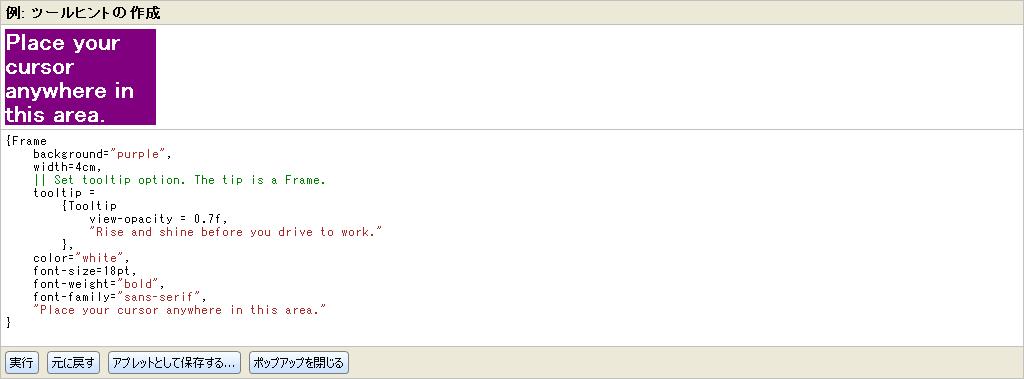
Tooltip クラスを使用すると、特定のグラフィカル オブジェクトの使用に関するヒントを作成できます。オブジェクトのインスタンスを生成する場合、
Tooltip は通常、(位置引数形式での) リスト引数として与えられるヒントでテキストを表示します。Curl 言語は、テキストだけでなく、各グラフィカル オブジェクトをヒントとしてサポートします。たとえば、ヒントとしてテキストを使用し、
Tooltip オブジェクトを作成するには次のように指定します。文字列は自動的にグラフィカル オブジェクトに変換されることに注意してください。
Tooltip.view-opacity オプションは、ツールチップを表示するのに使われるビューの不透明度を設定します。ビューにおける一般的なセきりティ制限のため、非特権アプレットで表示されるツールチップは、不透明度を、0.5 未満にすることは出来ません。
View.set-opacity を参照してください。このドキュメント・ビューワは、特権無しで実行しているので、ツールチップの不透明度が、0.5 未満であることを確認するにはこのサンプルをアプレットとして保存し、特権付アプレットとして実行しなければなりません。
ツールチップが装飾がないビューの中に表示されているので、装飾されていないビューのセキュリティ制限が適用されます。
View.default の中の
decorations? のドキュメントを参照してください。
Copyright © 1998-2019 SCSK Corporation.
All rights reserved.
Curl, the Curl logo, Surge, and the Surge logo are trademarks of SCSK Corporation.
that are registered in the United States. Surge
Lab, the Surge Lab logo, and the Surge Lab Visual Layout Editor (VLE)
logo are trademarks of SCSK Corporation.