{define-class public EllipticalCommandButtonUI {inherits CommandButtonUI}
|| Gradient FillPatterns for the unpressed and pressed button
field private _inner-up-right-gfp:FillPattern =
{uninitialized-value-for-type FillPattern}
field private _inner-down-right-gfp:FillPattern =
{uninitialized-value-for-type FillPattern}
|| Graphical structure for managing label
field private _label-box:#Graphic
field private _ellipse:EllipseGraphic = {EllipseGraphic}
field private _label-shifted-forward?:bool = false
{constructor public {default ...}
{construct-super ...}
{self.set-gradients self.control-color}
}
|| notice when control color changes and update self appropriately
{nonlocal-option public control-color:FillPattern
{self.set-gradients control-color}
{self.request-draw}
}
{method public {draw renderer2d:Renderer2d}:void
let bounds:GRect = {self.layout.get-bounds}
let top-edge:Distance = -bounds.ascent
let bottom-edge:Distance = bounds.descent
let left-edge:Distance = -bounds.lextent
let right-edge:Distance = bounds.rextent
let w:Distance = right-edge - left-edge
let h:Distance = bottom-edge - top-edge
|| render the outer ellipse in gradient of control-color
{renderer2d.render-ellipse
left-edge,
top-edge,
w,h,
fill-pattern = self._inner-up-right-gfp
}
|| Note super.draw is necessary for the graphical children
|| (i.e.the label) to be drawn
{super.draw renderer2d}
}
||----------------------------------------
|| Methods inherited from CommandButtonUI
||----------------------------------------
{method public {draw-as-normal}:void
set self._ellipse.fill-color = self._inner-up-right-gfp
{self.shift-label forward?=false}
{self.request-draw}
}
{method public {draw-as-disabled}:void
set self._ellipse.fill-color = self._inner-up-right-gfp
{self.shift-label forward?=false}
{self.request-draw}
}
{method public {draw-as-pressed}:void
set self._ellipse.fill-color = self._inner-down-right-gfp
{self.shift-label forward?=true}
{self.request-draw}
}
{method public {draw-as-rollover}:void
set self._ellipse.fill-color = self._inner-up-right-gfp
{self.shift-label forward?=true}
{self.request-draw}
}
{method public {modify-for-focus focus?:bool}:void
{if focus? then
set self._ellipse.color = {FillPattern.get-black}
else
set self._ellipse.color = self.control-color
}
{self.request-draw}
}
{method public {modify-for-default default?:bool}:void
}
{setter public {control control:Control}:void
set super.control = control
{self.setup-label}
}
{method public {react-to-visual-change}:void
{self.setup-label}
}
||-----------------------------------------------
|| Private utility methods
||----------------------------------------------
{method private {shift-label forward?:bool=true}
||if label is already shifted appropriately, do nothing
{if forward? == self._label-shifted-forward? then
{return}
}
||otherwise, shift label appropriately by pixel
let lc:LayoutContext = {self.get-layout-context}
let shift-distance:Distance = lc.layout-display-context.pixel-size
{if not forward? then
set shift-distance = -shift-distance
}
{self.child.shift-x-origin shift-distance, layout-context=lc}
{self.child.shift-y-origin shift-distance, layout-context=lc}
set self._label-shifted-forward? = not self._label-shifted-forward?
}
{method private {set-gradients bc:FillPattern}:void
|| set gradient patterns for the button up and down states
set self._inner-up-right-gfp =
{RadialGradientFillPattern
{Spectrum.from-endpoints "white", bc},
center = {Fraction2d 0.2, 0.2},
radius = 1.0
}
set self._inner-down-right-gfp =
{RadialGradientFillPattern
{Spectrum.from-endpoints "white", bc},
center = {Fraction2d 0.3, 0.3},
radius = 1.0
}
}
{method private {setup-label}:void
let btn = self.control asa CommandButton
{if-non-null label=btn.label then
set self._ellipse =
{EllipseGraphic
horigin="center",
vorigin="center",
color = self._inner-up-right-gfp
}
set self._label-box =
{OverlayBox
self._ellipse,
{HBox
{Fill width=15pt},
{VBox
{Fill height= 15pt},
{TextFlowBox
horigin="center",
vorigin="center",
label
},
{Fill height= 15pt}
},
{Fill width=15pt}
}
}
}
{self.add-internal self._label-box, replace?=true}
}
}
{let ellipse-laf:StandardLookAndFeel =
{StandardLookAndFeel}
}
||Registers EllipticalCommandButtonUI as the UI for command buttons
{let registered:bool =
{ellipse-laf.register-ui
CommandButton,
EllipticalCommandButtonUI}
}
{set ellipse-laf.color="green"}
{set ellipse-laf.control-color="blue"}
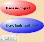
{Dialog
|| The following line sets look and feel for this dialog and
|| its children to one that makes command buttons elliptical
|| rather than the default
|| look-and-feel = ellipse-laf,
{spaced-vbox
background="wheat",
|| CommandButton 1
{CommandButton
|| The following line sets the UI object for this button
|| to the elliptical UI defined above
ui-object = {EllipticalCommandButtonUI},
control-color = {FillPattern.get-red},
label={bold Uses ui-object}
},
|| CommandButton 2
{CommandButton
|| The following line sets look and feel for this button to one that
|| makes command buttons elliptical rather than the default
look-and-feel = ellipse-laf,
label={bold Uses look-and-feel}
},
|| CommandButton 3
{CommandButton
enabled?=false,
label={bold disabled}
}
}
}
|| The following line resets the default look and feel
|| {set the-default-look-and-feel.target-look-and-feel = ellipse-laf}
| |