(クラス)
基本的なプッシュボタン コントロールを実装します。
説明
CommandButton は、アクションを実行するコントロールです。通常、この操作は左マウス ボタンで実行されますが、スペースバーまたは現在の look-and-feel に適したどのキーを使用しても実行できます。
文字列から
Label への自動変換があることに注意してください。アンパサンド文字 ('&') がボタンのニーモニックを示すプレフィックスとして認識されます。
注意事項
このオブジェクトは、"CommandButton"のスタイル ルールを記述することによってスタイル化することが出来ます。詳細は
スキンが適用されたボタン をご覧下さい。
例
| 例 |
 |
{CommandButton
    label = "&Click me!",
    style = "standard",
    {on Action at btn:CommandButton do
        set btn.label = "Thanks for the &Click."
    }
}
| |
予期されたイベント
Action:
これは、マウスやキーボード操作によって起動されます。
ビジュアル テスト
このクラスは、
CurlButton ビジュアル テスト タイプを実装します。すべての
Visual によってサポートされる既定のビジュアル テスト アクションの他に、このクラスのオブジェクトは次のアクションをサポートします。
| アクション | 引数 | 説明 |
|---|
| Click | <none> | ボタンをクリックします。 |
| コンストラクタ public | {CommandButton.default} |
アクセサ public final CommandButton.default?:
bool セッター public final CommandButton.default?:
bool 非ローカル オプション public CommandButton.enabled?:
bool ローカル オプション public CommandButton.fire-on-press?:
bool =false
アクセサ public CommandButton.label:#
Label セッター public CommandButton.label:#
Label ローカル オプション public CommandButton.label-inset:
any =4px
非ローカル オプション public CommandButton.repeat-delay:
Time 非ローカル オプション public CommandButton.repeat-interval:
Time | repeating?: | ボタンを押すことで、複数のアクション イベントが起動されるかどうかを判別します。 |
ローカル オプション public CommandButton.repeating?:
bool =false
ローカル オプション public CommandButton.show-focus?:
bool =true
| style: | ボタンのビジュアル スタイル。既定値は CommandButtonStyle.standard です。 |
アクセサ public CommandButton.style-element:
String | test-description: | ビジュアル テスト インフラストラクチャがこのオブジェクトの説明に使用する名前。エンド ユーザーはこの名前で視覚的にオブジェクトを探すことができます。 |
アクセサ public CommandButton.test-description:#
String | test-type-name: | このオブジェクトをテストのメソッドとプロパティにマッピングするために、ビジュアル テスト インフラストラクチャが使用するタイプ名。 |
アクセサ public CommandButton.test-type-name:#
String プロパティ 継承 ControlFrame:
color, control-color, control-content-background, font-family, font-size, font-style, font-weight, text-breakable?, text-line-through?, text-preserve-whitespace?, text-underline?, visible? プロパティ 継承 BaseFrame:
child, clonable-class?, completely-clonable-children?, graphical-children, halign-spec, hstretch?-spec, ordered-children, reverse-ordered-children, valign-spec, vstretch?-spec, width-first? プロパティ 継承 Visual:
_style-element, cursor, data-source, dragee, graphical-parent, has-key-focus?, input-method-enabled?, input-method-keyboard-mode, name, options, style-class, style-manager, style-options, test-child?, test-name, test-parent?, test-visible?, tooltip, user-data プロパティ 継承 Graphic:
avoid-page-break?, background, border-color, border-spec, border-style, border-width, cell-border-spec, cell-border-width, cell-margin, discrete-select-in-range?, graphic-selectable, height, horigin, is-paginating?, layout, margin, opaque-to-events?, option-parent, outside-margin, pagination-state, parent, possibly-displayed?, selection-context, shadow-color, shadow-spec, visual-parent, vorigin, width
| protected | {CommandButton.create-default-ui-object}:ControlUI |
| public | {CommandButton.handle-mnemonic}:void |
| public | {CommandButton.take-action}:void |
| test-run: | オブジェクトに対してビジュアル テスト アクションを実行します。 |
メソッド 継承 MultiUIControlFrame:
generate-ui-object, handle-look-and-feel-change, handle-observer-message, on-focus-in, option-changed, option-lookup-here, option-propagate-notify, react-to-state-change, react-to-visual-change, request-key-focus, set-layout メソッド 継承 BaseFrame:
add-internal, after-reposition, allocate-layout-object, attempt-revalidate-layout, before-reposition, clone-appearance-helper, compute-child-bounds, compute-parent-elastic, constrain-height, constrain-width, draw, end-pagination, get-height-preference, get-text, get-width-preference, install-child-bounds, internal-remove-child, note-attached, note-detaching, notify-option-children, paginate, pick-child, propagate-request-layout, register-options, set-size メソッド 継承 GuiEventTarget:
handle-delegate-event, handle-event, on-cancel-mode, on-commit, on-composition-change-event, on-composition-result-event, on-context-menu-event, on-current-record-change-request, on-current-record-changed, on-destroy-notify, on-destroy-requested, on-drag-over, on-drag-pointer, on-drag-started, on-drop, on-end-composition-event, on-focus-event, on-focus-out, on-gesture, on-gesture-begin, on-gesture-end, on-gesture-magnify, on-gesture-pan, on-gesture-rotate, on-gesture-swipe, on-gesture-tap, on-gesture-touch, on-grab-release, on-gui-event, on-input-method-event, on-key-event, on-pointer-button, on-pointer-crossing, on-pointer-event, on-pointer-motion, on-pointer-release, on-pointer-scroll, on-raw-key-event, on-raw-key-press, on-raw-key-release, on-reset, on-selectable-added, on-selectable-removed, on-selection-changed, on-selection-context-activated, on-selection-context-deactivated, on-selection-event, on-start-composition-event, on-start-event, on-stop-event, on-view-activate, on-view-deactivate, on-window-close, remove-event-handlers-for-event-class メソッド 継承 Visual:
add, add-from-init-args, animate, change-cursor, clonable-appearance?, clone-appearance, get-focus-manager, get-layout-context, get-test-parent, get-test-property, get-view, maybe-fire-attach-event, maybe-fire-detach-event, non-keyword-init-arg, note-caret-position, on-drag-leave, on-pointer-leave, pop-cursor, prepare-test-object, prepare-test-parent, push-cursor, quantize-width, refresh-style-options, release-key-focus, scroll-to-include, test-record, transform-from-display-coordinates, transform-from-graphical-root-coordinates, transform-to-display-coordinates, transform-to-graphical-root-coordinates メソッド 継承 Graphic:
create-pagination-state, detach, draw-range-as-selected, draw-shadow, find-ancestor, find-graphical-ancestor, fire-inferior-crossing-event, get-graphical-root, get-gui-path, get-origin-in-graphical-ancestor, get-origin-in-root, get-pagination-state, get-top-left-in-ancestor, get-visible-bounds-into, on-drag-enter, on-inspection, on-pointer-enter, paint-with-decorations, replace-with, request-draw, request-draw-rect, request-pointer-trace, search-next, search-prev, start-pagination, xy-offset-to メソッド 継承 OptionListInterface:
add-option, add-style-option, change-option-parent-notify, clone-options, get-option, get-option-by-name, keyword-init-arg, local-add-notify, local-remove-notify, name-to-option-key, new-option-item, option-change-notify, option-lookup, option-set?, propagate-option-change, remove-option, remove-style-option, remove-styles, set-option-by-name, set-style-option-by-name, unset-option-by-name, unset-style-option-by-name
(コンストラクタ)
| public | {CommandButton.default} |
text-breakable?: 既定では、ラベルは複数行に改行されません。
ui-object: 描画とイベントを処理する UI デリゲート。
...: イベント ハンドラとオプション設定
(アクセサ)
アクセサ public final CommandButton.default?:
bool セッター public final CommandButton.default?:
bool
この項目はサポートされていません。内部使用限定となっています。
この CommandButton が Dialog の既定のステータスを視覚的に表示するかどうかを決定します。
プログラミング注意事項
既定の CommandButton を管理する
Dialog によって設定する必要があります。
(非ローカル オプション)
public CommandButton.enabled?:
bool Visual が有効であるかどうかを指定します。
説明
このオプションが false の場合、オブジェクトやGUI オブジェクトとのユーザー インタラクションは無効になります。
このオプションを
true に設定する代わりに、オプションを
unset する方が一般的です。これにより、一部の親コンテナの値は、有効な値を判別します。
- このオプションが false の場合、オプションに応じて、テキストは disabled-color および disabled-text-sunken? で表示されます。
例
| 例 |
 |
{paragraph I am enabled}
{paragraph enabled? = false, I'm not}
| |
このオプションが false で、
Visual がコントロールの場合、コントロールのユーザー インターフェイスは無効になります。前述したように、ラベル上の任意のテキストは、無効状態で表示されます。
例
| 例 |
 |
{radio-buttons
    value = "first",
    {RadioButton radio-value = "first"},
    {RadioButton
        radio-value = "second",
        reactive-label = {ReactiveLabel
                             label-disabled = "(second)"
                         },
        enabled? = false
    },
    {RadioButton radio-value = "third"}
}
| |
(ローカル オプション)
public CommandButton.fire-on-press?:
bool =false
アクション イベントがボタンを押して起動されるかどうかを判別します。
注意事項
導入:
バージョン 6.0
(アクセサ)
アクセサ public CommandButton.label:#
Label セッター public CommandButton.label:#
Label ボタン上に表示するラベル。
説明
オブジェクトのその他のタイプの場合は、
Label への自動変換が実行されます。値が文字列の場合、アンパサンド文字 ('&') は、ボタンのニーモニックを示すプレフィックスとして認識されます。
(ローカル オプション)
public CommandButton.label-inset:
any =4px
ラベルとボタン端との間に配置されるスペース量。
説明
このプロパティは、スタイル CommandButtonStyle.standard および CommandButtonStyle.rollover のボタンを描画するときに使用されます。
このプロパティの値は 0 以上の距離であり、アプリケーションの前にピクセル サイズに丸められます。
Graphic.margin プロパティと同様に処理されます (詳細を確認してください)。
標準 UI デリゲートはボタンにフォーカスがあることを示す四角形を描画するこの挿し込みが提供する領域を使用します。この挿し込みが完全に削除される場合は、標準デリゲートはラベルの上部にこのフォーカス四角形を描画します。
(アクセサ)
ボタン コントロールが押されたときや無効にされたときなどの、さまざまなラベルの表示方法を設定します。
プログラミング注意事項
ほとんどの
CommandButton では、単純な
label プロパティを使用するだけで十分です。ボタンが押されたとき、ロールオーバーされたとき、または無効にされたときにラベルを明示的に変更する場合に使用します。
(非ローカル オプション)
public CommandButton.repeat-delay:
Time ボタンを押してから、繰り返される Action イベントが開始されるまでの時間の遅れを規定します。
注意事項
導入:
バージョン 6.0
(非ローカル オプション)
public CommandButton.repeat-interval:
Time 2つの連続する Action イベントの起動間での時間の遅れを規定します。
注意事項
導入:
バージョン 6.0
(ローカル オプション)
public CommandButton.repeating?:
bool =false
ボタンを押すことで、複数のアクション イベントが起動されるかどうかを判別します。
注意事項
導入:
バージョン 6.0
(ローカル オプション)
public CommandButton.show-focus?:
bool =true
ボタンがキー フォーカスを視覚的に表示するかどうかを指定します。
(アクセサ)
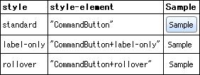
ボタンのビジュアル スタイル。既定値は CommandButtonStyle.standard です。
プログラミング注意事項
値は次のいずれかであることが必要です。
- standard: look-and-feel によって指定されたビジュアルが常にラベルの周囲に表示される、従来のプッシュ ボタンのように表示されます。
- label-only: look-and-feel は、プログラマが提供するラベルには、ボタンにいつフォーカスがあるかを示す四角形以外、ビジュアルを追加しません。
- rollover: 通常のボタン ビジュアルは、マウス ポインタがボタン上にある場合にのみ表示されます。ボタン上にない場合、ボタンの現在の状態に合うラベルのみが表示されます。
(アクセサ)
アクセサ public CommandButton.style-element:
String スタイリングの目的のための、この CommandButton の "要素" や "型" です。
説明
CommandButton は、
style プロパティにより幾つかの異なる形状を取ることが出来ます。
style-element の値は、以下のテーブルに示されるように、スタイル ルールがそれぞれ異なるスタイルを指定できるようにする為に、スタイルに依存します。
(アクセサ)
アクセサ public CommandButton.test-description:#
String ビジュアル テスト インフラストラクチャがこのオブジェクトの説明に使用する名前。エンド ユーザーはこの名前で視覚的にオブジェクトを探すことができます。
説明
これは、ビジュアル テスト インフラストラクチャを実行するテスト ツールのユーザー インターフェイスに表示される値です。
既定では、この値はこのオブジェクトを参照する
Label (ある場合) を探して取得されます。独自の説明が設定されているオブジェクトは、このメソッドをオーバーライドする必要があります。たとえば、
CommandButton には内部の
Label が含まれているため、その Lavel の値を返します。
(アクセサ)
アクセサ public CommandButton.test-type-name:#
String このオブジェクトをテストのメソッドとプロパティにマッピングするために、ビジュアル テスト インフラストラクチャが使用するタイプ名。
説明
ビジュアル テストを正しく実行するには、テストは次のいずれかのタイプでなければなりません。特定のテスト タイプの詳細については、リストされている実装例の test-run および get-test-property メソッドの説明を参照してください。
オブジェクトのセマンティクスに近い、いずれかの定義済みテスト タイプの使用を検討してください。ただし、テスト タイプを変更せずにオブジェクトにテストのアクションとプロパティを追加する方が簡単な場合もあります。
(メソッド)
| protected | {CommandButton.create-default-ui-object}:ControlUI |
このオブジェクトに適切な UI オブジェクトを作成します。
説明
このメソッドは、現在の
LookAndFeel がこのコントロールの UI オブジェクトを指定しない場合にのみ使用されます。
(メソッド)
| public | {CommandButton.handle-mnemonic}:void |
ボタンのニーモニック キーが押されたときの機能を決定します。
説明
(メソッド)
Action イベントのスタティック イベント ハンドラ。
説明
(メソッド)
(メソッド)
| public | {CommandButton.take-action}:void |
ボタンの Action イベントを発生させます。
説明
ユーザーのマウス クリックまたはキー リリースをビジュアルなしでプログラムでシミュレーションします。
(メソッド)
オブジェクトに対してビジュアル テスト アクションを実行します。
action: 実行するアクションの名前。
args: ビジュアル テスト アクションの引数。ビジュアル テスト インフラストラクチャは、引数の数と型をチェックしますが、値はチェックしません。実装では、すべての有効な値を処理し、不正な値に対しては例外またはエラーをスローするようにしてください。
説明
そのクラスによってサポートされたテスト動作のリストについてクラスのドキュメントを御読み下さい。
既定の実装では、RawClick などの一般的な操作を処理し、action が既知のアクションに一致しない場合にはリフレクションを使用してメソッドを呼び出します。
注意事項
QuickTest Property™ のビジュアル テスト環境では、任意の実行時メソッドを直接呼び出せません。代わりに CallMethod アクションを使用して、最初の引数としてメソッド名を渡してください。ビジュアル テスト インフラストラクチャは、CallMethod アクションを実際のアクションに変換してから test-run を呼び出します。
注意事項
オーバーライド
新しいテスト アクションを追加するには、action と新しいアクションの名前を照合します。一致する場合は、引数を処理してアクションを実行し、適切なタイプの値 (戻り値がない場合は null) を返します。action が新しいテスト アクションに一致しない場合は、super.test-run を呼び出します。