|
let pieset:PieSet = {PieSet
rs,
“Risk”,
||枠線の色
wedge-group =
{ShapeGroup
border-color = “white”
},
||ラベルに使用するデータ
label-data =
{ChartDataSeries rs, “Event”},
||ラベルの作成
label-factory = {proc {pie-set:PieSet,
set-label:#String,
data-label:#String,
value-label:#String,
position:Distance2d,
data:ChartDataSeries,
record:Record,
record-index:int,
inner-radius:Distance,
outer-radius:Distance,
total-radius:Distance,
start-angle:Angle,
stop-angle:Angle
}:Shape ||返却の型がShapeなので文字以外でも画像等をラベルに指定することも可能です
let font-col:FillPattern = “#222222” ||まず、基本の文字色を宣言します
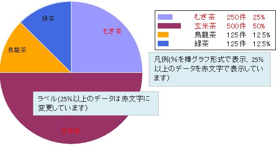
{if record[“Risk”] asa double >= 25 then ||Risk項目が25%以上であれば、文字色を赤に設定します
set font-col = “red”
}
{return
{TextShape
font-size = 10pt,
color = font-col,
halign = “center”,
valign = “center”,
translation = position, ||文字の配置は、この部分で変更できます
{non-null data-label}
}
}
},
||凡例の表示
legend-enabled? = true,
||凡例の作成
legend-entry-factory = {proc {chart:Chart,
data-series:ChartDataSeries,
record:#Record,
color:FillPattern,
legend-index:int
}:Graphic
let font-col:FillPattern = “black”
{return
{HBox
valign = “center”,
||%に連動した棒グラフを作成しています
{Fill
width = (record[“Risk”] asa double * .5pt) + 10pt,
height = 8pt,
background = color, ||色は円グラフの色と連動しています
border-width = 0px
},
{Fill width = {make-elastic minimum-size = 20pt}},
||%が25%以上のデータに対しては、文字列を赤く変更しています
{if-non-null record then
{if record[“Risk”] asa double >= 25 then
set font-col = “red”
}
{HBox
color = font-col,
{TextFlowBox
width = 50pt,
{data-series.field.domain.format
record[data-series.field.name]
}
},
{TextFlowBox width = 40pt, record[“Number”] & “件”},
{TextFlowBox width = 30pt, {String record[“Risk”]} & “%”}
}
else
data-series.field.caption
}
}
}
}
}
|