サブクラス化したコントロールで継承したメソッドをオーバーライドすることにより、機能を変更して提供することもできます。例えば、ユーザーがクリックした時に、ログアウト処理を実行するログアウトボタンを作成するとします。以下のサンプルでは、その様なボタンを作成しています。
Action イベントのスタティック イベント ハンドラでログアウト処理を実行します。サンプルでは、ボタンを含むダイアログを単に閉じることで、ログアウトをシミュレートしています。イベントとイベント ハンドラについての詳細は、
イベント の章を参照してください。
| 例:
ボタンにログアウト機能を追加 |
 |
{define-class LogoutButton {inherits CommandButton}

  {constructor {default ...}
    {construct-super ...}
    set self.label = "logout"
  }
  {method public {on-action e:Action}:void
    {e.consume}
    {if-non-null self.dialog then
        {self.dialog.close Dialog.cancel}
    }
  }
}
{let dialog:Dialog =
    {Dialog
        width = 3cm, height = 3cm,
        {LogoutButton}
    }
}
{CommandButton
    label = "Open Dialog",
    {on Action at b:CommandButton do
        let v:#View = {b.get-view}
        {unless dialog.open? do
            {dialog.show modal? = false, owner = v}
        }
    }
}
| |
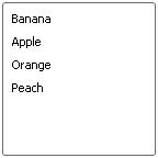
次の例では
OutlinedListValueItem と呼ばれる
ListValueItem のサブクラスを作成し、リスト アイテムが選択されたときにその周りに赤い縁取りをします。また
OutlinedListValueItem を自動的に使用して渡されたデータの値のリストからリスト アイテムを作成する、
OutlinedListBox と呼ばれる
ListBox の特化型を作成します。
OutlinedListBox は
default-list-item-creation-proc と呼ばれるデータの値から
ListItem を作成するクラス プロシージャを定義し、そのプロシージャをコンストラクタの
construct-super 呼び出しで引数として渡します。
| 例:
アウトライン リスト アイテムに対する ListBox の作成 |
 |
{define-class public OutlinedListValueItem {inherits ListValueItem}

  {constructor public {default
                          label:Visual,
                          value:any = null,
                          enabled?:bool = true
                      }
    {construct-super
        label,
        enabled? = enabled?,
        value = value
    }
    set self.border-width = 3px
    set self.margin = 1px
    set self.border-color = {self.background.to-FillPattern}
  }

  {method protected {adjust-visuals}:void
    {if self.selected? then
        set self.border-color = {FillPattern.get-red}
     else
        set self.border-color = {self.background.to-FillPattern}
    }
  }
}

{define-class public OutlinedListBox {inherits ListBox}

  || Constructor: pass on all arguments to parent,
  || substituting the proper default list-item-creation-proc
  {constructor {default ...}
    {construct-super
        list-item-creation-proc =
            OutlinedListBox.default-list-item-creation-proc,
        ...
    }
  }
  || specify the custom list-item-creation-proc
  {define-proc {default-list-item-creation-proc val:any}:ListItem
    {return
        {OutlinedListValueItem
            value = val,
            val
        }
    }
  }
}
{OutlinedListBox "Banana","Apple","Orange", "Peach"}
| |
既存のコントロールをサブクラス化するその他の例として、Web アプリケーションで広く使用されているボタン
LinkButton のバージョンがあります。このボタンの外観はハイパーリンクのように見えますが、
CommandButton のすべての機能を継承しています。コードをトリガして他の場所へ移動する場合に特に便利です。
LinkButton の方法は実に簡単です。
CommandButton のスタイルを
CommandButtonStyle.label-only に設定すると、ボタン自体が長方形の無い状態で描画されることを確認してみてください。このスタイルをすべての
LinkButton に既定として設定し、適切なリアクティブ ラベルを追加すると、ハイパーリンクは次のようになります。
| 例:
ハイパーリンクの CommandButton の作成 |
 |
|| LinkButton --CommandButton with the appearance of a hyperlink
{define-class LinkButton {inherits CommandButton}

  {constructor {default
                   label:Visual = "LinkButton",
                   text-underline?:bool = true,
                   outline?:bool = false,
                   color:FillPattern = {FillPattern.get-blue},
                   color-rollover:FillPattern = {FillPattern.get-red},
                   color-pressed:FillPattern = {FillPattern.get-red},
                   ...
               }

    || 1. Set the style of the button appropriately
    ||    Also set button to inherit formatting from document
    {construct-super
        style = CommandButtonStyle.label-only,
        control-appearance-changeable? = true,
        ...
    }

    || 2. Add a reactive label based on clones of the label passed in
    let regLabel:#Visual = {label.clone-appearance}
    let roverLabel:#Visual = {label.clone-appearance}
    let pressLabel:#Visual = {label.clone-appearance}

    set regLabel.text-underline? = text-underline?
    set roverLabel.text-underline? = text-underline?
    set pressLabel.text-underline? = text-underline?

    set regLabel.color = color
    set roverLabel.color = color-rollover
    set pressLabel.color = color-pressed

    {if outline? then
        set regLabel =
            {Frame
                border-width = 1px,
                margin = 3px,
                border-color = color,
                regLabel
            }
        set roverLabel =
            {Frame
                border-width = 1px,
                margin = 3px,
                border-color = color-rollover,
                roverLabel
            }
        set pressLabel =
            {Frame
                border-width = 1px,
                margin = 3px,
                border-color = color-pressed,
                pressLabel
            }
    }

    {set self.reactive-label =
        {ReactiveLabel
            label = regLabel,
            label-rollover = roverLabel,
            label-pressed = pressLabel
        }
    }
  }
}

|| Examples
{LinkButton
    label = "Visit the White House Web Site (Curl language version)",
    {on Action at btn:CommandButton do
        {popup-message
            "Sorry this site is still under construction!"
        }
    }
}
{LinkButton
    label =
        {image source = {url "../../default/images/whlogo-big-stripe.gif"}},
    outline? = true,
    {on Action at btn:CommandButton do
        {popup-message
            "Sorry this site is still under construction!"
        }
    }
}
| |
注意: LinkButton の control-appearance-changeable? オプションを既定で true に設定します。通常このオプションは、他の GUI Toolkit コントロールでは既定で FALSE に設定されています。ここではオプションを true に設定し、LinkButton が既定でその親コンテナまたはドキュメントの書式属性を持つようにします。
前の例では、
Visual.clone-appearance を使用して、ラベルの複数のコピー、つまりリアクティブ ラベルのそれぞれのビューをコンストラクタに渡す方法について見てきました。単一のグラフィカル オブジェクトをグラフィック階層内の複数の場所に置くことができないことを思い出してください。1 つの入力ラベルをリアクティブ ラベルの 3 つの部分すべてに使用しようとすると、予期しない結果を招くことがあります。
アプリケーションが標準のどの GUI Toolkit とも大きく異なる外観と動作のインタラクティブなコントロールを必要とする場合は、既存のコントロールのサブクラス化および変更では不十分です。このセクションでは新しいコントロールを作成する方法について説明します。Curl IDE はCurl のコントロール クラスの API のソース コードを提供しています。Curl のコントロールがどのように実装されているかを分析することは、独自のコントロールの実装方法の理解に役立つでしょう。また Curl のコントロールのオープン ソース コードは開発の便利な始点ともなるでしょう。このリソースの検索と使用についての詳細は、「
オープン コントロール」を参照してください。
外観と同様に、コントロールのユーザーに対するレスポンスについての重要な側面は、コントロール UI に実装されています。
コントロール UIの変更方法についての詳細は、「
カスタム コントロール UI の作成」を参照してください。
「
コントロールクラスの階層」のセクションではCurl のコントロールが多くの動作を継承するクラスについて説明しています。必要なカスタム 機能のタイプによって、カスタム コントロールは1つ以上の上位クラスを土台にできます。
次のリストはカスタム コントロール作成の手順を要約しています。
- 必要に応じて ControlFrame または ValueControlFrame-of をサブクラス化します。
- 関連するラベル、データおよびインタラクティブな要素をグラフィカル コンテナに追加して、コンストラクタにコントロールを作成します。
- GuiEventTarget のスタティック イベント ハンドラをオーバーライドし、フォーカスを取得して表示するコントロールを有効にし、ユーザーのマウスおよびキーボードの操作に適切に反応するようにします。
- コントロールに適用するイベントを作成、発生させます。Action、ValueChanged など、このタイプのコントロールに意味的に適したカスタム イベントを含めます。
- 値を持つコントロールについては、ゲッター pending-value? およびメソッド set-value-with-events の実装を提供します。
ControlFrame は情報を表示するコントロールの適切な開始ポイントです。ユーザーの対話が可能ですが、特定の値をユーザーから収集するためのものではありません。こうしたコントロールの例としては、
CommandButton、Web ページのヒットカウンタ、株式市場やニュースを流すスクロールなどがあります。
最初に、
ControlFrame が
Box の子孫にあたる
BaseFrame の子孫であることに注意してください。この系統から、
ControlFrame は任意のグラフィック レイアウトに配置し、グラフィカル オプションを継承し、フレームで起動されるさまざまなイベントについてスタティックおよびダイナミック イベント ハンドラを定義する機能を継承しています。
BaseFrame は
Frame の親クラスであること、および単一のグラフィカルな子を保持するように設計されているコンテナであることに注意してください。
さらに、
ControlFrame はダイアログに配置され、タブ移動が可能で、フォーカスを取得し、ニーモニック キーボード ショートカットに応答する機能を継承します。この機能の概要は、
StandardControl とその親クラスで定義されます。
次の例では、現在の時刻を表示するだけの簡単なコントロールを作成します。コントロールはタブを使ってダイアログ内を移動したり、無効にすることができます。
ClockControl のコードは、現在の時刻にリンクされた
Dynamic 文字列およびこのデータを定期的に更新する
Timer です。この文字列は、適切なグラフィカル オブジェクトに変換され、コントロールのグラフィック階層に追加されます。
| 例:
ControlFrame の使用 |
 |
|| ClockControl

|| Basic control for viewing the current time.
|| This is a non-editable control akin to a TextDisplay.

{define-class public ClockControl {inherits ControlFrame}

  || Formatted time string, which will change dynamically
  field private time-display-string:Dynamic={Dynamic ""}

  || Constructor
  {constructor {default}
    || BaseFrame functionality
    || add a display view of the current time
    set self.time-display-string.value = {DateTime}.info.locale-time
    {self.add-internal
        {Frame
            border-width = 1px,
            margin = 2px,
            border-color = {self.background.to-FillPattern},
            {TextFlowBox text-selectable? = false,
                self.time-display-string
            }
        }
    }

    || add a timer to update the display.
    || an interval of 1s should show every second tick
    {self.animate
        interval = 1s,
        {on TimerEvent do
            {if self.enabled? then
                set self.time-display-string.value =
                    {DateTime}.info.locale-time
            }
        }
    }
  }
  || provide GuiEvent functionality:
  || on-focus-in:  give border that shows selected state
  {method public {on-focus-in e:FocusIn}:void
    {if not self.enabled? then
        {return}
    }
    let ch:Graphic = {self.graphical-children.read-one}
    set ch.border-color = {FillPattern.get-gray}
  }

  || on-focus-out: hide selected border
  {method public {on-focus-out e:FocusOut}:void
    {if not self.enabled? then
        {return}
    }
    let ch:Graphic = {self.graphical-children.read-one}
    set ch.border-color = {self.background.to-FillPattern}
  }

  || on-pointer-press: make control selectable with mouse
  {method public {on-pointer-press e:PointerPress}:void
    {if not self.enabled? then
        {return}
    }
    {e.consume}
    {self.request-key-focus}
  }
}

|| Example
{Dialog
    {spaced-vbox
        {ClockControl},
        {CheckButton
            label = "Clock Enabled",
            enabled? = true,
            value = true,
            {on ValueFinished at c:CheckButton do
                set c.parent.enabled? = c.value
            }
        }
    }
}
| |
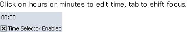
次の例では、時間の選択に使用できる基本コントロールを作成します。この TimeSelectorControl の基本的な内容は、前に説明した ClockControl と非常によく似ています。時間を表示する動的文字列がコントロールのグラフィック階層に追加され、必要に応じて更新されます。TimeSelectorControl のグラフィカルな動作は ClockControl ともよく似ています。主な違いは、値が編集できることを示すために、テキストを枠で囲むのではなくハイライト表示することです。
| 例:
ValueControlFrame-of クラスの使用 |
 |
|| TimeSelectorControl = a control for selecting a time
||
|| This is an editable control,|with a value of DateTime.
|| For clarity, the Date portion of the time will always
|| be the date of the epoch, and times truncated to minutes
||
{define-class public TimeSelectorControl
  {inherits {ValueControlFrame-of DateTime}}

  || dynamic display strings for time:
  field private hrs-display:Dynamic = {Dynamic  "00"}
  field private mins-display:Dynamic = {Dynamic "00"}
  field private _value:DateTime = {DateTime}
  field private has-focus?:bool = false

  || pending-value? indicate whether user currently changing value
  field private _pending-value?:bool = false
  {getter {pending-value?}:bool
    {return self._pending-value?}
  }

  || Constructor
  {constructor {default val = {DateTime hour = 12}, ...}
    {construct-super  ...}
    set self._value = val

    || BaseFrame functionality
    || add a display view of the current time setting,
    || with appropriate event handlers
    {self.add-internal
        {HBox
            border-width = 1px,
            margin = 2px,
            border-color = {self.background.to-FillPattern},
            {TextFlowBox text-selectable? = false,
                self.hrs-display,
                {on p:PointerPress do
                    {if self.has-focus? then
                        {self.set-value-with-events self.value+1hr}
                        {p.consume}
                    }
                }
            },
            ":",
            {TextFlowBox text-selectable? = false,
                self.mins-display,
                {on p:PointerPress do
                    {if self.has-focus? then
                        {self.set-value-with-events self.value+1min}
                        {p.consume}
                    }
                }
            }
        }
    }
  }

  || GuiEvent functionality--
  || on-focus-in:
  {method public {on-focus-in e:FocusIn}:void
    {if not self.enabled? then {return}}
    let ch:Graphic = {self.graphical-children.read-one}
    set ch.background = "#000090"
    set ch.color = {FillPattern.get-white}
    set self.has-focus? = true
  }

  || on-focus-out:
  {method public {on-focus-out e:FocusOut}:void
    {if not self.enabled? then {return}}
    let ch:Graphic = {self.graphical-children.read-one}
    {unset ch.background}
    {unset ch.color}
    set self.has-focus? = false

    {if self._pending-value? then
        {self.enqueue-event {ValueFinished}}
        set self._pending-value? = false
    }
  }

  || on-pointer-press:
  {method public {on-pointer-press e:PointerPress}:void
    {if not self.enabled? then {return}}
    {e.consume}
    {self.request-key-focus}
  }

  || ValueControl-of Functionality
  {getter public open {has-value?}:bool {return true} }

  {method public open {unset-value}:void
    set self.value = {DateTime}
  }

  {getter public open {value}:DateTime
    {return self._value}
  }

  {setter public open {value d:DateTime}:void
    || Normalize time and trigger the display
    set self._value = {DateTime
                          hour = d.info.hour,
                          minute = d.info.minute
                      }
    set self.hrs-display.value = {TimeSelectorControl.padded-int d.info.hour}
    set self.mins-display.value = {TimeSelectorControl.padded-int d.info.minute}
  }

  || set-value-with-events: handle (or simulate) the user actually
  || setting/resetting the value with the ui
  {method public {set-value-with-events t:DateTime}:void
    set self.value = t || actually set the value (see above)
    {self.enqueue-event {ValueChanged}}
    set self._pending-value? = true
  }

  || padded-int: local utility to convert integer into two character string
  {define-proc {padded-int v:int}:String
    {return {if v <= 9 then {String "0"&v} else {String v}}}
  }

}


|| Display Example
{paragraph Click on hours or minutes to edit time, tab to shift focus.}
{Dialog
    {spaced-vbox
        {TimeSelectorControl},
        {CheckButton label = "Time Selector Enabled",
            enabled? = true,
            value = true,
            {on ValueFinished at c:CheckButton do
                set c.parent.enabled? = c.value
            }
        }
    }
}
| |
このコントロールには、value を設定する代わりの方法が 2 つあることに注目してください。1 番目の方法は、継承した value のセッターをオーバーライドすることです。セッターの定義は絶対に必要ではありませんが、あれば便利です。このアクセッサの新しいコードではいくつかの時間フィールドに入力し、コントロールの表示を更新し、継承したセッター (super.value) を呼び出して新しい値を格納します。
値を変更する 2 番目のメソッド
set-value-with-events も標準メソッドで、GUI Toolkit のすべてのValue コントロールで定義されています。呼び出して、ユーザーによるコントロールの実際の使用を実行 (またはシミュレーション) します。この役割は、コントロールの値を実際に変更するだけでなく、値を変更するための適切なイベントを生成し、コントロール自体で発生させることです。この場合、コントロールは値の変更すべてについてイベント
ValueChanged を発生させる必要があります。コントロールがフォーカスを失うと、対応する
ValueFinished が発生します。その他のコントロールは、特定のコントロールの意味に適したカスタム イベントのようなその他のイベント (通常は
Action イベント) を発生させる必要があります。
ユーザーがコントロールを使用しているかどうか、値がさらに変更されるかどうかを示すための標準ゲッター
pending-value? が実装されています。このメソッドは、GUI Toolkit のすべてのValue コントロールに実装されています。(詳細については「
Value(値) コントロール」を参照してください。)
このセクションでは、Mercury QuickTest Professional®(QTP)
でテストをサポートするカスタム コントロールを記述する方法を説明します。
QTP テスト ツールに関する情報は
Mercury QuickTest Professional をご覧ください。
QTP での Curl アプレットのテスト方法は Curl IDE ドキュメントを御覧下さい。
以下の例では
MyObject と呼ばれる
Frame のサブクラスを作成します。
MyObject は、いくつかのポインタ アクションのイベント ハンドラを提供しますが、
QTP テスト用の特別なサポートは実装してません。
この例を保存して実行し、テスト スクリプトを記録してみてください。
このオブジェクトの
RawClick、
RawDoubleClick および
MouseDrag などの操作は記録できます。
| 例:
テスト サポート なし |
 |
{define-class public MyObject {inherits Frame}
  field private on?:bool
  field private grab?:bool
  field private within?:bool

  {constructor public {default ...}
    {construct-super background = "red", ...}
  }

  {method public open {on-pointer-press e:PointerPress}:void
    {if not e.consumed? then
        {e.continue-implicit-pointer-grab self}
        set self.grab? = true
        set self.within? = true
        set self.background = {if self.on? then "pink" else "lime"}
        {e.consume}
    }
    {super.on-pointer-press e}
  }

  {method public open {on-pointer-motion e:PointerMotion}:void
    {if not e.consumed? then
        {if self.grab? then
            let bounds:GRect = {self.layout.get-cell-bounds}
            set self.within? = {bounds.within? e.x, e.y}
            set self.background =
                {if self.within? == self.on? then "pink" else "lime"}
        }
        {e.consume}
    }
    {super.on-pointer-motion e}
  }

  {method public open {on-pointer-release e:PointerRelease}:void
    {if not e.consumed? then
        set self.grab? = false
        {if self.within? then
            set self.on? = not self.on?
        }
        set self.background = {if self.on? then "green" else "red"}
        {e.consume}
    }
    {super.on-pointer-release e}
  }
}
{MyObject width=1in, height=1in, test-name = "Clicker"}
| |
次の例は前の例と似ていますが、QTP テスト サポートが追加されています。
保存、実行、そして記録すると、低位ポインタ アクションの代わりに、
Activate アクションが一つ記録されます。
例では以下の点に注意してください。
on-pointer-release イベント ハンドラは test-record を使って Activate を記録します。
{self.test-record "Activate"}
それぞれのイベント ハンドラは GuiInputEvent.test-recorded? を使って、
イベントがテスト記録済みであることをマークし、一般のイベントが記録されるのを防ぎます。
set e.test-recorded? = true
例では test-run メソッドをオーバーライドして Activate アクションをプレイ バックできるようにします。
{method public open {test-run method:String, args:FastArray}:any
    {if method == "Activate" then
        set self.on? = not self.on?
        {return null}
    }

    {return {super.test-run method, args}}
}
ゲッター test-type-name をオーバーライドして新しいテスト タイプを定義します。
{getter public open {test-type-name}:#String
    {return "MyTestObject"}
}
get-test-property メソッドは、is on プロパティをサポートします。
{method public open {get-test-property name:String}:any
    {if name == "is on" then
        {return self.on?}
    }

    {return {super.get-test-property name}}
}
次の点にも注意してください。
- 記録前にイベントをマークする必要があります。
- QTP が、アクション記録時のオブジェクトの状態を反映するスクリーン ショットを取得できるように、
オブジェクトを変更する前に自分自身で記録するべきです。
- test-run および
get-test-property の super メソッドを呼びだす必要があります。
- アクションおよびプロパティを追加または取り除く場合は、
QTP に通知できるよう test-type-name を変更する必要があります。
- オブジェクトにラベルが通常関連している場合は、Visual.test-description
をオーバーライドする必要があります。 CommandButton はボタンのテキストを返します。
- TestRecorder.record-values-by-index? を見て、名前またはインデックスのどちらで一連の項目を記録かを検証します。
このアプローチは DropdownList で使います。
Curl コントロール API はオープン ソースとして利用可能であり、
コントロールの QTP テスト サポートにおいて有用な情報源となります。
「
オープン コントロール」を参照してください。
| 例:
テスト サポート あり |
 |
{define-class public MyTestObject {inherits Frame}
  field private on?:bool
  field private grab?:bool
  field private within?:bool

  {constructor public {default ...}
    {construct-super background = "red", ...}
  }

  {method public open {on-pointer-press e:PointerPress}:void
    {if not e.consumed? then
        set e.test-recorded? = true
        {e.continue-implicit-pointer-grab self}
        set self.grab? = true
        set self.within? = true
        set self.background = {if self.on? then "pink" else "lime"}
        {e.consume}
    }
    {super.on-pointer-press e}
  }

  {method public open {on-pointer-motion e:PointerMotion}:void
    {if not e.consumed? then
        {if self.grab? then
            set e.test-recorded? = true
            let bounds:GRect = {self.layout.get-cell-bounds}
            set self.within? = {bounds.within? e.x, e.y}
            set self.background =
                {if self.within? == self.on? then "pink" else "lime"}
        }
        {e.consume}
    }
    {super.on-pointer-motion e}
  }

  {method public open {on-pointer-release e:PointerRelease}:void
    {if not e.consumed? then
        set e.test-recorded? = true
        set self.grab? = false
        {if self.within? then
            {self.test-record "Activate"}
            set self.on? = not self.on?
        }
        set self.background = {if self.on? then "green" else "red"}
        {e.consume}
    }
    {super.on-pointer-release e}
  }

  {method public open {test-run method:String, args:FastArray}:any
    {if method == "Activate" then
        set self.on? = not self.on?
        {return null}
    }

    {return {super.test-run method, args}}
  }

  {getter public open {test-type-name}:#String
    {return "MyTestObject"}
  }

  {method public open {get-test-property name:String}:any
    {if name == "is on" then
        {return self.on?}
    }

    {return {super.get-test-property name}}
  }

}

{MyTestObject width=1in, height=1in}
| |
Copyright © 1998-2019 SCSK Corporation.
All rights reserved.
Curl, the Curl logo, Surge, and the Surge logo are trademarks of SCSK Corporation.
that are registered in the United States. Surge
Lab, the Surge Lab logo, and the Surge Lab Visual Layout Editor (VLE)
logo are trademarks of SCSK Corporation.