コントロールでは、このオプションは、テキストの色および小さいシンボル (
例
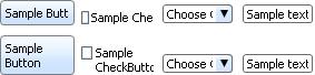
| 例: 色の指定 | |
 | |
{HBox valign="bottom", spacing=4pt,
    control-appearance-changeable?=true, color="red",
    {CommandButton label="Sample Button"},
    {CheckButton label="Sample"},
    {Scrollbar width=.8in, direction=Orientation.horizontal},
    {ComboBox width=1.2in, prompt="Choose One", "First", "Second"},
    {TextField width=1.0in, value="Sample text"}
}
|