CalendarControl (クラス)
public CalendarControl {inherits {MultiUIValueControlFrame-of #DateTime}}
インポート元: CURL.GUI.STANDARD. package 内で定義されています CURL.GUI.CONTROL-LOGICAL.

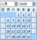
ユーザーが曜日を選択できるグラフィカルなコントロールです。

説明

DateDataModel は、CalendarControl に関連付けられています。
CalendarControl には、CalendarControl.min-valueCalendarControl.max-value によって決定される下限と上限があります。
CalendarControl.has-value? は、CalendarControl に値があるかないかを決定します。
既定では、CalendarControl.locale は月と曜日の名称に影響します。

予期されたイベント

ValueChanged: ユーザーがユーザー インターフェイスを使用して CalendarControl の値を変更した場合に発生します。CalendarControl.set-value-with-events が呼び出され、値が変更された場合、または CalendarControl で設定状態と未設定状態を切り替えた場合にも発生します。
ValueFinished: ValueChanged イベントの発生後、および CalendarControl.set-value-with-events が呼び出されると、コントロールの値の変更の有無に関係なくいつでも発生します。

ビジュアル テスト

このクラスは、CurlCalendar ビジュアル テスト タイプを実装します。
すべての Visual によってサポートされる既定のビジュアル テスト アクションの他に、このクラスのオブジェクトは次のアクションをサポートします。
アクション 引数 説明
Set val:Stringカレンダーの値を設定します。UTC タイム ゾーンに変換後、値は DateTime を使用して解析されます。このため、一番良いのは日付だけを設定することです。
すべての Visual によってサポートされる既定のビジュアル テスト プロパティの他に、このクラスのオブジェクトは次のビジュアル テスト プロパティをサポートします。
プロパティ 説明
value:StringISO 日付として書式設定された、コントロールの現在値です。

注意事項

このオブジェクトは、"CalendarControl"、"CalendarControlDayFrame"、"CalendarControlDayTable"のスタイル ルールを記述することによってスタイル化することが出来ます。詳細は スキンが適用されたカレンダーコントロール をご覧下さい。

コンストラクタ
default:CalendarControl コントロールを作成します。
コンストラクタ public {CalendarControl.default
locale:Locale = {get-working-locale},
data-model:#DateDataModel = null,
min-value:#DateTime = null,
max-value:#DateTime = null,
value:#DateTime = null,
start-weekday:int = 7,
ui-object:#CalendarControlUI = null,
...
}

プロパティ
calendar-control-header-background:CalendarControl の年間通算週のヘッダーおよび曜日ヘッダーの背景に使用される色です。
非ローカル オプション public CalendarControl.calendar-control-header-background:Background
calendar-control-header-color:CalendarControl の年間通算週のヘッダーおよび曜日ヘッダーのテキストに使用される色です。
非ローカル オプション public CalendarControl.calendar-control-header-color:FillPattern
calendar-control-holiday-background:休日用の背景色です。
非ローカル オプション public CalendarControl.calendar-control-holiday-background:Background
calendar-control-holiday-color:休日用のテキストの色です。
非ローカル オプション public CalendarControl.calendar-control-holiday-color:FillPattern
calendar-control-selected-day-color:選択された日を示すための色です。
非ローカル オプション public CalendarControl.calendar-control-selected-day-color:FillPattern
calendar-control-today-background:現在の日付の背景色です。
非ローカル オプション public CalendarControl.calendar-control-today-background:Background
calendar-control-today-color:現在の日付のテキストの色です。
非ローカル オプション public CalendarControl.calendar-control-today-color:FillPattern
data-model:このオブジェクトに関連付けられている DateDataModel
アクセサ public CalendarControl.data-model:DateDataModel
セッター public CalendarControl.data-model:DateDataModel
day-proc:月のそれぞれの日の外観をカスタマイズするためのオプション プロシージャを指定します。
ローカル オプション public CalendarControl.day-proc:#{proc-type {cc:CalendarControl, date:DateTime }:(graphic:#Graphic, selectable?:bool) } =null
display-month:CalendarControl のユーザー インターフェイスで表示される月を示します。
アクセサ public CalendarControl.display-month:int
display-year:CalendarControl のユーザー インターフェイスで表示される年を示します。
アクセサ public CalendarControl.display-year:int
has-value?:CalendarControl に値があるかどうかを示します。
アクセサ public CalendarControl.has-value?:bool
holidays:休日の一覧です。
ローカル オプション public CalendarControl.holidays:#{Array-of DateTime} =null
locale:CalendarControl のロケール。
アクセサ public CalendarControl.locale:Locale
セッター public CalendarControl.locale:Locale
max-value:CalendarControl の上限です。
アクセサ public CalendarControl.max-value:DateTime
セッター public CalendarControl.max-value:DateTime
min-value:CalendarControl の下限です。
アクセサ public CalendarControl.min-value:DateTime
セッター public CalendarControl.min-value:DateTime
month-names:CalendarControl.locale 内の月の完全名の配列です。
アクセサ public CalendarControl.month-names:{ReadOnlyArray-of String}
navigation-changes-value?:月または年を変更して CalendarControl をナビゲートした場合に、CalendarControlUI のサブクラスが CalendarControl.value を変更するかどうかを示します。
ローカル オプション public CalendarControl.navigation-changes-value?:bool =false
next-month:現在表示されている CalendarControl 内の月および年の 1 月後に最も近い日付で、CalendarControl.min-valueCalendarControl.max-value の間に調整されています。
アクセサ public CalendarControl.next-month:DateTime
next-year:現在表示されている CalendarControl 内の月および年の 1 年後に最も近い日付で、CalendarControl.min-valueCalendarControl.max-value の間に調整されています。
アクセサ public CalendarControl.next-year:DateTime
previous-month:現在表示されている CalendarControl 内の月および年の 1 月前に最も近い日付で、CalendarControl.min-valueCalendarControl.max-value の間に調整されています。
アクセサ public CalendarControl.previous-month:DateTime
previous-year:現在表示されている CalendarControl 内の月および年の 1 年前に最も近い日付で、CalendarControl.min-valueCalendarControl.max-value の間に調整されています。
アクセサ public CalendarControl.previous-year:DateTime
short-month-names:CalendarControl.locale 内の月の省略名の配列です。
アクセサ public CalendarControl.short-month-names:{ReadOnlyArray-of String}
short-weekday-names:CalendarControl.locale 内の曜日の省略名の配列です。
アクセサ public CalendarControl.short-weekday-names:{ReadOnlyArray-of String}
show-adjacent-dates?:CalendarControl が現在のカレンダー領域に収まる隣接月から日付を表示するかどうかを示します。
ローカル オプション public CalendarControl.show-adjacent-dates?:bool =false
show-date-controls?:CalendarControl が日のみを表示し、月と年のセレクタを非表示にするかどうかを示します。
ローカル オプション public CalendarControl.show-date-controls?:bool =true
show-week-of-year?:CalendarControl が年間通算週を表示するかどうかを示します。
ローカル オプション public CalendarControl.show-week-of-year?:bool =false
start-weekday:CalendarControl の週の開始日です。
アクセサ public CalendarControl.start-weekday:int
セッター public CalendarControl.start-weekday:int
style-element:スタイリングの目的のための、この Visual の "要素" や "型" です。
アクセサ public CalendarControl.style-element:String
takes-focus?:この ActiveTraversor がトラバース関連のアクティビティに参加しているかどうかを表すブール式。
ローカル オプション public CalendarControl.takes-focus?:bool
test-type-name:このオブジェクトをテストのメソッドとプロパティにマッピングするために、ビジュアル テスト インフラストラクチャが使用するタイプ名。
アクセサ public CalendarControl.test-type-name:#String
value:CalendarControl の値。
アクセサ public CalendarControl.value:#DateTime
セッター public CalendarControl.value:#DateTime
weekday-names:CalendarControl.locale 内の曜日の完全名の配列です。
アクセサ public CalendarControl.weekday-names:{ReadOnlyArray-of String}
weekday-proc:曜日ラベルの外観をカスタマイズするためのオプション プロシージャを指定します。
ローカル オプション public CalendarControl.weekday-proc:#{proc-type {cc:CalendarControl, weekday:int }:#Graphic } =null
weeknumber-proc:週番号ラベルの外観をカスタマイズするためのオプション プロシージャを指定します。
ローカル オプション public CalendarControl.weeknumber-proc:#{proc-type {cc:CalendarControl, week-of-year:int, year:int }:#Graphic } =null
プロパティ 継承 MultiUIControlFrame: _ui-object, _ui-set-locally?, control-appearance-changeable?, display-context, focus-object, look-and-feel, options-present-here, ui-object
プロパティ 継承 ValueControl-of: value-as-any, value-type
プロパティ 継承 ControlFrame: color, control-color, control-content-background, enabled?, font-family, font-size, font-style, font-weight, text-breakable?, text-line-through?, text-preserve-whitespace?, text-underline?, visible?
プロパティ 継承 ValueControl: form-value
プロパティ 継承 BaseFrame: child, clonable-class?, completely-clonable-children?, graphical-children, halign-spec, hstretch?-spec, ordered-children, reverse-ordered-children, valign-spec, vstretch?-spec, width-first?
プロパティ 継承 CommandBinding: bound-command, bound-command-impl
プロパティ 継承 Control: control-container, dialog, focus-skin, form, skin
プロパティ 継承 ActiveTraversor: _active-traversal-container, active-traversal-container, mnemonic, tab-index, valid?, validation-result
プロパティ 継承 GetBoundsBox: layout-locally-valid?, layout-valid?
プロパティ 継承 EventTarget: event-handlers
プロパティ 継承 Visual: _style-element, cursor, data-source, dragee, graphical-parent, has-key-focus?, input-method-enabled?, input-method-keyboard-mode, name, options, style-class, style-manager, style-options, test-child?, test-description, test-name, test-parent?, test-visible?, tooltip, user-data
プロパティ 継承 Box: clip-child-shadows?
プロパティ 継承 Graphic: avoid-page-break?, background, border-color, border-spec, border-style, border-width, cell-border-spec, cell-border-width, cell-margin, discrete-select-in-range?, graphic-selectable, height, horigin, is-paginating?, layout, margin, opaque-to-events?, option-parent, outside-margin, pagination-state, parent, possibly-displayed?, selection-context, shadow-color, shadow-spec, visual-parent, vorigin, width
プロパティ 継承 DataBindingTarget: data-binding-context, data-bindings
プロパティ 継承 OptionListInterface: option-register-proc, registered-option-keys

メソッド
create-data-model:この CalendarControlDateDataModel を作成します。
protected {CalendarControl.create-data-model
min-value:DateTime,
max-value:DateTime,
value:#DateTime
}:DateDataModel
create-default-ui-object:このオブジェクトに適切な UI オブジェクトを作成します。
protected {CalendarControl.create-default-ui-object}:ControlUI
get-test-property:このオブジェクトのテスト プロパティ値を返します。
public {CalendarControl.get-test-property name:String}:any
handle-observer-message:監視対象のオブジェクトがメッセージを送信するときにこのメソッドを呼び出します。Observer はこのメソッドを実装して、変更が発生したときに処理を実行する必要があります。
protected {CalendarControl.handle-observer-message
sender:Observable,
message:any
}:void
note-holidays-changed:この UI に CalendarControl.holidays の内容が変更されたことを通知します。
public {CalendarControl.note-holidays-changed}:void
react-to-state-change:コントロールの状態が変更された場合に、コントロールの外観を変更します。
protected {CalendarControl.react-to-state-change}:void
set-display-month-year:CalendarControl ユーザー インターフェイスで表示される月と年を示します。
public {CalendarControl.set-display-month-year
month:int = -1,
year:int = -1
}:void
set-value-with-events:インタラクティブに値を設定するユーザーをシミュレーションします。
public {CalendarControl.set-value-with-events val:#DateTime}:void
test-run:オブジェクトに対してビジュアル テスト アクションを実行します。
public {CalendarControl.test-run action:String, args:FastArray}:any
unset-value:これは、CalendarControl.valuenull に設定します。
public {CalendarControl.unset-value}:void
メソッド 継承 MultiUIValueControlFrame-of: unset-property
メソッド 継承 MultiUIControlFrame: generate-ui-object, handle-look-and-feel-change, on-focus-in, option-changed, option-lookup-here, option-propagate-notify, react-to-visual-change, request-key-focus, set-layout
メソッド 継承 ControlFrame: become-active, clear
メソッド 継承 BaseFrame: add-internal, after-reposition, allocate-layout-object, attempt-revalidate-layout, before-reposition, clone-appearance-helper, compute-child-bounds, compute-parent-elastic, constrain-height, constrain-width, draw, end-pagination, get-height-preference, get-text, get-width-preference, install-child-bounds, internal-remove-child, note-attached, note-detaching, notify-option-children, paginate, pick-child, propagate-request-layout, register-options, set-size
メソッド 継承 Control: on-pointer-press
メソッド 継承 BasicBox: contains-point?, find-graphic-at, handle-crossing, on-pointer-envelope-event, pointer-enter-occurred, pointer-leave-occurred
メソッド 継承 StandardActiveTraversor: become-active-from-traversal, fire-event-at-container, handle-mnemonic, on-key-press
メソッド 継承 Observer: observe, stop-observing
メソッド 継承 GuiEventTarget: handle-delegate-event, handle-event, on-action, on-cancel-mode, on-command-changed, on-commit, on-composition-change-event, on-composition-result-event, on-context-menu-event, on-current-record-change-request, on-current-record-changed, on-destroy-notify, on-destroy-requested, on-drag-over, on-drag-pointer, on-drag-started, on-drop, on-end-composition-event, on-focus-event, on-focus-out, on-gesture, on-gesture-begin, on-gesture-end, on-gesture-magnify, on-gesture-pan, on-gesture-rotate, on-gesture-swipe, on-gesture-tap, on-gesture-touch, on-grab-release, on-gui-event, on-input-method-event, on-key-event, on-pointer-button, on-pointer-crossing, on-pointer-event, on-pointer-motion, on-pointer-release, on-pointer-scroll, on-raw-key-event, on-raw-key-press, on-raw-key-release, on-reset, on-selectable-added, on-selectable-removed, on-selection-changed, on-selection-context-activated, on-selection-context-deactivated, on-selection-event, on-start-composition-event, on-start-event, on-stop-event, on-view-activate, on-view-deactivate, on-window-close, remove-event-handlers-for-event-class
メソッド 継承 ActiveTraversor: mark-invalid, mark-valid
メソッド 継承 GetBoundsBox: get-bounds, get-elastic-bounds-into, get-nonparent-bounds-into, request-layout, validate-layout
メソッド 継承 EventTarget: accepts-event-class?, add-event-handler, event-handler-present?, remove-event-handler, verify-event
メソッド 継承 Visual: add, add-from-init-args, animate, change-cursor, clonable-appearance?, clone-appearance, get-focus-manager, get-layout-context, get-test-parent, get-view, maybe-fire-attach-event, maybe-fire-detach-event, non-keyword-init-arg, note-caret-position, on-drag-leave, on-pointer-leave, pop-cursor, prepare-test-object, prepare-test-parent, push-cursor, quantize-width, refresh-style-options, release-key-focus, scroll-to-include, test-record, transform-from-display-coordinates, transform-from-graphical-root-coordinates, transform-to-display-coordinates, transform-to-graphical-root-coordinates
メソッド 継承 Box: compare-children, find-test-children, get-delimited-child-text-selection, get-gui-path-to-child, get-range-as-selected-text, get-visible-rect-in-root-into, graphical-child-visible-at, make-gui-mark, search-next-here, search-prev-here
メソッド 継承 BasicEventTarget: enqueue-event
メソッド 継承 GraphicOptions: any-to-Distance, get-display-context
メソッド 継承 Graphic: create-pagination-state, detach, draw-range-as-selected, draw-shadow, find-ancestor, find-graphical-ancestor, fire-inferior-crossing-event, get-graphical-root, get-gui-path, get-origin-in-graphical-ancestor, get-origin-in-root, get-pagination-state, get-top-left-in-ancestor, get-visible-bounds-into, on-drag-enter, on-inspection, on-pointer-enter, paint-with-decorations, replace-with, request-draw, request-draw-rect, request-pointer-trace, search-next, search-prev, start-pagination, xy-offset-to
メソッド 継承 DataBindingTarget: add-data-binding, get-data-binding, refresh-data-binding, remove-data-binding, update-data-binding, validate-data-binding
メソッド 継承 OptionListInterface: add-option, add-style-option, change-option-parent-notify, clone-options, get-option, get-option-by-name, keyword-init-arg, local-add-notify, local-remove-notify, name-to-option-key, new-option-item, option-change-notify, option-lookup, option-set?, propagate-option-change, remove-option, remove-style-option, remove-styles, set-option-by-name, set-style-option-by-name, unset-option-by-name, unset-style-option-by-name
メソッド 継承 InitRestArgParser: process-rest-args
メソッド 継承 Object: object-describe, object-describe-for-debugging, object-serialize


コンストラクタ詳細
default (コンストラクタ)
public {CalendarControl.default
locale:Locale = {get-working-locale},
data-model:#DateDataModel = null,
min-value:#DateTime = null,
max-value:#DateTime = null,
value:#DateTime = null,
start-weekday:int = 7,
ui-object:#CalendarControlUI = null,
...
}

CalendarControl コントロールを作成します。

locale:
CalendarControl のロケールです。
既定のロケールは、get-working-locale によって決定された作業ロケールです。
data-model:
このコントロールに関連付けられている DateDataModel です。
null の場合、このコントロールのデータ モデルを作成するために、CalendarControl.create-data-model が呼び出されます。
min-value:
CalendarControl の下限です。
nulldata-model が指定されていない場合、コントロールの下限は 1 年の初日に設定されます。
max-value:
CalendarControl の上限です。
nulldata-model が指定されていない場合、コントロールの上限は 9999 年の最終日に設定されます。
value:
既定の DateTime です。
valuenull で、data-modelnull である場合、または valuenull で、data-modelnull でないが、DateDataModel.has-value? が false である場合は、CalendarControl.has-value?false です。
data-modenull の場合、このコントロールの DateDataModel を作成するために、CalendarControl.create-data-model が呼び出されます。
valuenull でない場合、このコントロールの値は value です。
CalendarControl.has-value?true の場合、コントロールの値は常に CalendarControl.min-valueCalendarControl.max-value の間になります。
start-weekday:
CalendarControl の週の開始日です。
1 ~ 7 とすることができます。1 は月曜日、7 は日曜日を表わします。
既定では日曜日を表わす 7 です。
ui-object: 描画とイベントを処理する UI デリゲート。
...: 追加オプションを指定します。

注意事項

CalendarControl.has-value?true の場合、CalendarControl.display-monthCalendarControl.display-year は、CalendarControl.value を使用してそれぞれ月と年に設定されます。それ以外では、現在の月と年が CalendarControl 範囲内にあれば、現在の月と年の値に設定されます。範囲内にない場合には、CalendarControl の最小値または最大値の月と年になります。どちらになるかは、現在の月と年が CalendarControl の範囲の前にあるか、後にあるかによります。
CalendarControlDateDataModel に関連付けられているので、CalendarControl.valueCalendarControl.min-value、および CalendarControl.max-value は日付情報だけを持ち、時刻情報はすべて 0 に設定されます。タイム ゾーンは、DateTimeZone.utc に設定されます。


プロパティ詳細
calendar-control-header-background (非ローカル オプション)
public CalendarControl.calendar-control-header-background:Background

CalendarControl の年間通算週のヘッダーおよび曜日ヘッダーの背景に使用される色です。


calendar-control-header-color (非ローカル オプション)
public CalendarControl.calendar-control-header-color:FillPattern

CalendarControl の年間通算週のヘッダーおよび曜日ヘッダーのテキストに使用される色です。


calendar-control-holiday-background (非ローカル オプション)
public CalendarControl.calendar-control-holiday-background:Background

休日用の背景色です。


calendar-control-holiday-color (非ローカル オプション)
public CalendarControl.calendar-control-holiday-color:FillPattern

休日用のテキストの色です。


calendar-control-selected-day-color (非ローカル オプション)
public CalendarControl.calendar-control-selected-day-color:FillPattern

選択された日を示すための色です。


calendar-control-today-background (非ローカル オプション)
public CalendarControl.calendar-control-today-background:Background

現在の日付の背景色です。


calendar-control-today-color (非ローカル オプション)
public CalendarControl.calendar-control-today-color:FillPattern

現在の日付のテキストの色です。


data-model (アクセサ)
アクセサ public CalendarControl.data-model:DateDataModel
セッター public CalendarControl.data-model:DateDataModel

このオブジェクトに関連付けられている DateDataModel

注意事項

データ モデルを設定すると、新しいデータ モデルの内容に一致するよう CalendarControl.value が変更されます。
また、CalendarControl.has-value?true に設定されます。


day-proc (ローカル オプション)
public CalendarControl.day-proc:#{proc-type {cc:CalendarControl, date:DateTime }:(graphic:#Graphic, selectable?:bool) } =null

月のそれぞれの日の外観をカスタマイズするためのオプション プロシージャを指定します。

注意事項

NULL でない場合、表示可能な曜日ごとにこのプロシージャが呼び出され、返された Graphic は、null でなければ CalendarControl に既定の Graphic の代わりに表示されます。返された値 selectable? が false である場合、ユーザー インターフェイスではその日が選択できません。
既定では、NULL です。

週末の曜日を選択できない CalendarControl です。

{CalendarControl
    day-proc =
        {proc {cc:CalendarControl, date:DateTime}:(#Graphic, bool)
            let constant info:DateTimeInfo = date.info
            let weekend?:bool = info.day-of-week >= 6
            
            {return
                {if weekend? then
                    {text
                        text-line-through? = true,
                        disabled-color = FillPattern.pink,
                        {value info.day}
                    }
                 else
                    null
                },
                not weekend?
            }
        }
}


display-month (アクセサ)
アクセサ public CalendarControl.display-month:int

CalendarControl のユーザー インターフェイスで表示される月を示します。

注意事項

1 ~ 12 とすることができます。1 は 1 月、12 は 12 月を表わします。
これは、CalendarControl.set-display-month-year を呼び出すことにより設定できます。


display-year (アクセサ)
アクセサ public CalendarControl.display-year:int

CalendarControl のユーザー インターフェイスで表示される年を示します。

注意事項

これは、CalendarControl.set-display-month-year を呼び出すことにより設定できます。


has-value? (アクセサ)
アクセサ public CalendarControl.has-value?:bool

CalendarControl に値があるかどうかを示します。

注意事項

CalendarControl.unset-value」も参照してください。


holidays (ローカル オプション)
public CalendarControl.holidays:#{Array-of DateTime} =null

休日の一覧です。

説明

null でない場合、これらの日付が calendar-control-holiday-colorcalendar-control-holiday-background を使用して CalendarControl に表示されます。
既定ではこの値は NULL です。

注意事項

この配列の内容を変更する場合、CalendarControl.note-holidays-changed を呼び出して、変更が表示されるようにしてください。
SkinnableCalendarControlUI は、DateDataModel.compare メソッドを使用して、CalendarControl 内の日付を休日として表示するかどうかを決定します。
DateTime.date#factory も参照してください。


locale (アクセサ)
アクセサ public CalendarControl.locale:Locale
セッター public CalendarControl.locale:Locale

CalendarControl のロケール。

注意事項

このオプションの値は次の操作に影響します。CalendarControl.month-namesCalendarControl.short-month-namesCalendarControl.weekday-names、および CalendarControl.short-weekday-names


max-value (アクセサ)
アクセサ public CalendarControl.max-value:DateTime
セッター public CalendarControl.max-value:DateTime

CalendarControl の上限です。

注意事項

CalendarControlmax-valueCalendarControl.min-value 未満に設定されると、エラーがスローされます。
CalendarControl.has-value?true であると、CalendarControl.value は、CalendarControl.min-valueCalendarControl.max-value の間になるよう調整されます。


min-value (アクセサ)
アクセサ public CalendarControl.min-value:DateTime
セッター public CalendarControl.min-value:DateTime

CalendarControl の下限です。

注意事項

CalendarControlmin-valueCalendarControl.max-value より大きく設定されると、エラーがスローされます。
CalendarControl.has-value?true であると、CalendarControl.value は、CalendarControl.min-valueCalendarControl.max-value の間になるよう調整されます。


month-names (アクセサ)
アクセサ public CalendarControl.month-names:{ReadOnlyArray-of String}

CalendarControl.locale 内の月の完全名の配列です。


navigation-changes-value? (ローカル オプション)
public CalendarControl.navigation-changes-value?:bool =false

月または年を変更して CalendarControl をナビゲートした場合に、CalendarControlUI のサブクラスが CalendarControl.value を変更するかどうかを示します。

プログラミング注意事項

CalendarControlUI のサブクラスはこのフラグをチェックして、月と年を変更して CalendarControl をナビゲートしたときに、CalendarControlUI.value を変更するかどうかを決定します。
既定では、false です。
CalendarControl.navigation-changes-value?true の時、月と年を変えると、ユーザー インターフェイスで CalendarControl の値が CalendarControl.value または CalendarControl.set-value-with-events を介して変更します。それ以外はナビゲートのために CalendarControl.set-display-month-year メソッドを呼び出します。

注意事項

CalendarControl.navigation-changes-value?false から true に切り替えられ、CalendarControl.has-value?true の場合、SkinnableCalendarControlUICalendarControl の現在値に基づいて月と年を表示します。


next-month (アクセサ)
アクセサ public CalendarControl.next-month:DateTime

現在表示されている CalendarControl 内の月および年の 1 月後に最も近い日付で、CalendarControl.min-valueCalendarControl.max-value の間に調整されています。

説明

CalendarControl.has-value?true の場合、CalendarControl.value の日が戻り値を計算するのに使用されます。そうでなければ、月の最初の日が計算に使用されます。


next-year (アクセサ)
アクセサ public CalendarControl.next-year:DateTime

現在表示されている CalendarControl 内の月および年の 1 年後に最も近い日付で、CalendarControl.min-valueCalendarControl.max-value の間に調整されています。

説明

CalendarControl.has-value?true の場合、CalendarControl.value の日が戻り値を計算するのに使用されます。そうでなければ、月の最初の日が計算に使用されます。


previous-month (アクセサ)
アクセサ public CalendarControl.previous-month:DateTime

現在表示されている CalendarControl 内の月および年の 1 月前に最も近い日付で、CalendarControl.min-valueCalendarControl.max-value の間に調整されています。

説明

CalendarControl.has-value?true の場合、CalendarControl.value の日が戻り値を計算するのに使用されます。そうでなければ、月の最初の日が計算に使用されます。


previous-year (アクセサ)
アクセサ public CalendarControl.previous-year:DateTime

現在表示されている CalendarControl 内の月および年の 1 年前に最も近い日付で、CalendarControl.min-valueCalendarControl.max-value の間に調整されています。

説明

CalendarControl.has-value?true の場合、CalendarControl.value の日が戻り値を計算するのに使用されます。そうでなければ、月の最初の日が計算に使用されます。


short-month-names (アクセサ)
アクセサ public CalendarControl.short-month-names:{ReadOnlyArray-of String}

CalendarControl.locale 内の月の省略名の配列です。


short-weekday-names (アクセサ)
アクセサ public CalendarControl.short-weekday-names:{ReadOnlyArray-of String}

CalendarControl.locale 内の曜日の省略名の配列です。


show-adjacent-dates? (ローカル オプション)
public CalendarControl.show-adjacent-dates?:bool =false

CalendarControl が現在のカレンダー領域に収まる隣接月から日付を表示するかどうかを示します。


show-date-controls? (ローカル オプション)
public CalendarControl.show-date-controls?:bool =true

CalendarControl が日のみを表示し、月と年のセレクタを非表示にするかどうかを示します。


show-week-of-year? (ローカル オプション)
public CalendarControl.show-week-of-year?:bool =false

CalendarControl が年間通算週を表示するかどうかを示します。

注意事項

ISO 8601 は、週は月曜日から始まると定義しています。CalendarControl.start-weekday が 1 でない (カレンダーが月曜日から始まらない) 場合、行で月曜日より前の曜日は前週に組み入れられます。


start-weekday (アクセサ)
アクセサ public CalendarControl.start-weekday:int
セッター public CalendarControl.start-weekday:int

CalendarControl の週の開始日です。

注意事項

1 ~ 7 とすることができます。1 は月曜日、7 は日曜日を表わします。
既定では日曜日を表わす 7 です。


style-element (アクセサ)
アクセサ public CalendarControl.style-element:String

スタイリングの目的のための、この Visual の "要素" や "型" です。

説明

この実装によって Visual._style-elementの値が返されますが、通常は定数を返すためにオーバーライドされます。

オーバーライド

Visual のサブクラスのスタイルが他のオブジェクトと異なる場合、このゲッターは適切な文字列を返すようにオーバーライドされる必要があります。 慣例では,この文字列はクラス名または、オブジェクトを生成するマークアップの名前です。
オーバーライドでは、空の文字列でないかぎり、self._style-elementを返さなければなりません。
導入: バージョン 6.0


takes-focus? (ローカル オプション)
public CalendarControl.takes-focus?:bool

この ActiveTraversor がトラバース関連のアクティビティに参加しているかどうかを表すブール式。

説明

false の場合、オブジェクトは become-active の要求を拒否します。オブジェクトはこれによりタブのトラバース中にスキップされ、オブジェクトの操作がキー フォーカスまたは「アクティブ指定」を別のトラバーサから受け取ることはありません。既定値は true です。


test-type-name (アクセサ)
アクセサ public CalendarControl.test-type-name:#String

このオブジェクトをテストのメソッドとプロパティにマッピングするために、ビジュアル テスト インフラストラクチャが使用するタイプ名。

説明

ビジュアル テストを正しく実行するには、テストは次のいずれかのタイプでなければなりません。特定のテスト タイプの詳細については、リストされている実装例の test-run および get-test-property メソッドの説明を参照してください。
オブジェクトのセマンティクスに近い、いずれかの定義済みテスト タイプの使用を検討してください。ただし、テスト タイプを変更せずにオブジェクトにテストのアクションとプロパティを追加する方が簡単な場合もあります。


value (アクセサ)
アクセサ public CalendarControl.value:#DateTime
セッター public CalendarControl.value:#DateTime

CalendarControl の値。

注意事項

CalendarControl.valuenull でない値に設定すると、CalendarControl.has-value?true に設定されます。それ以外は false です。
valnull でないと、CalendarControl.display-monthCalendarControl.display-yearCalendarControl の新しい値に調整されます。

プログラミング注意事項

CalendarControl.valuenull ではないため、CalendarControl.has-value?true である場合のみ使用できます。


weekday-names (アクセサ)
アクセサ public CalendarControl.weekday-names:{ReadOnlyArray-of String}

CalendarControl.locale 内の曜日の完全名の配列です。


weekday-proc (ローカル オプション)
public CalendarControl.weekday-proc:#{proc-type {cc:CalendarControl, weekday:int }:#Graphic } =null

曜日ラベルの外観をカスタマイズするためのオプション プロシージャを指定します。

注意事項

NULL でない場合、各曜日ごとにこのプロシージャが呼び出され、返された Graphic は、null でなければ、CalendarControl に既定の Graphic の代わりに表示されます。
曜日は 1 ~ 7 で、1 は月曜日、7 は日曜日を表わします。
既定では、NULL です。


weeknumber-proc (ローカル オプション)
public CalendarControl.weeknumber-proc:#{proc-type {cc:CalendarControl, week-of-year:int, year:int }:#Graphic } =null

週番号ラベルの外観をカスタマイズするためのオプション プロシージャを指定します。

注意事項

NULL でない場合、年間通算週ごとにこのプロシージャが呼び出され、返された Graphic は、null でなければ CalendarControl に既定の Graphic の代わりに表示されます。
このプロシージャが呼び出されるのは、CalendarControl.show-week-of-year?true の場合のみです。
既定では、NULL です。


メソッド詳細
create-data-model (メソッド)
protected {CalendarControl.create-data-model
min-value:DateTime,
max-value:DateTime,
value:#DateTime
}:DateDataModel

この CalendarControlDateDataModel を作成します。

min-value: DateDataModel の下限です。
max-value: DateDataModel の上限です。
value: データ モデルの初期値。

説明

既定の実装では DateDataModel コンストラクタが呼び出されます。

注意事項

通常は、このメソッドは直接呼び出されません。data-model のコンストラクタが null の場合に、CalendarControl のコンストラクタによって呼び出されます。サブクラスでこのメソッドをオーバーライドして、DateDataModel のサブクラスを返すことができます。


create-default-ui-object (メソッド)
protected {CalendarControl.create-default-ui-object}:ControlUI

このオブジェクトに適切な UI オブジェクトを作成します。

説明

このメソッドは、現在の LookAndFeel がこのコントロールの UI オブジェクトを指定しない場合にのみ使用されます。


get-test-property (メソッド)
public {CalendarControl.get-test-property name:String}:any

このオブジェクトのテスト プロパティ値を返します。

説明

既定の実装では、リフレクションを使用してオブジェクトの実行時プロパティの値を取得します。プロパティを実行時のインターフェイスではなくテスト環境に追加する場合は、サブクラスでこのメソッドをオーバーライドする必要があります。

注意事項

参照:canonical-test-value


handle-observer-message (メソッド)
protected {CalendarControl.handle-observer-message
sender:Observable,
message:any
}:void

監視対象のオブジェクトがメッセージを送信するときにこのメソッドを呼び出します。Observer はこのメソッドを実装して、変更が発生したときに処理を実行する必要があります。

sender: 変更があった Observable オブジェクトです。
message: これは、Observer からの変更に関する詳細情報が含まれています。詳細情報がない場合は NULL になります。


note-holidays-changed (メソッド)
public {CalendarControl.note-holidays-changed}:void

この UI に CalendarControl.holidays の内容が変更されたことを通知します。

説明

CalendarControl.holidays リストを直接変更する場合は、必ずこのメソッドを呼び出す必要があります。このリストに対する変更が正しく反映されるようにするためです。

注意事項

このメソッドは、CalendarControlUI.note-holidays-changed を呼び出して、変更を反映する必要があることを UI に通知します。
CalendarControl.holidays プロパティ自体を変更する場合は、このメソッドを呼び出す必要はありません。


react-to-state-change (メソッド)
protected {CalendarControl.react-to-state-change}:void

コントロールの状態が変更された場合に、コントロールの外観を変更します。

説明

このコントロールが non-null の UI オブジェクトをすでに持っている場合、このメソッドは ControlUI.react-to-state-change への呼び出しを生成します。

オーバーライド

通常はオーバーライドされません。


set-display-month-year (メソッド)
public {CalendarControl.set-display-month-year
month:int = -1,
year:int = -1
}:void

CalendarControl ユーザー インターフェイスで表示される月と年を示します。

month:
CalendarControl.display-month の新しい値です。
month == -1 の場合は無視されます。それ以外は month は 1 ~ 12 とする必要があります。1 は 1 月、12 は 12 月を表わします。
year:
CalendarControl.display-year の新しい値です。
year == -1 の場合は無視されます。

注意事項

表示年の表示月が CalendarControl.min-valueCalendarControl.max-value の間にない場合は、自動的にその範囲内になるよう調整されます。
CalendarControl.value が自動的にこのメソッドを呼び出して、CalendarControl.display-monthCalendarControl.display-year を設定します。
CalendarControl.navigation-changes-value?」も参照してください。


set-value-with-events (メソッド)
public {CalendarControl.set-value-with-events val:#DateTime}:void

インタラクティブに値を設定するユーザーをシミュレーションします。

説明

CalendarControl の値を設定してから、値が実際に変更されるか、CalendarControl が未設定状態から設定状態に変更されたら、ValueChanged イベントを発生させます。次に ValueFinished イベントが発生します。

注意事項

ValueChanged イベントと ValueFinished イベントを発生させたくない場合、CalendarControl.value セッターを使用して、CalendarControl の値を直接設定します。値が変更されなくても、
ValueFinished が発生することがあります。


test-run (メソッド)
public {CalendarControl.test-run action:String, args:FastArray}:any

オブジェクトに対してビジュアル テスト アクションを実行します。

action: 実行するアクションの名前。
args: ビジュアル テスト アクションの引数。ビジュアル テスト インフラストラクチャは、引数の数と型をチェックしますが、値はチェックしません。実装では、すべての有効な値を処理し、不正な値に対しては例外またはエラーをスローするようにしてください。

説明

そのクラスによってサポートされたテスト動作のリストについてクラスのドキュメントを御読み下さい。
既定の実装では、RawClick などの一般的な操作を処理し、action が既知のアクションに一致しない場合にはリフレクションを使用してメソッドを呼び出します。

注意事項

QuickTest Property™ のビジュアル テスト環境では、任意の実行時メソッドを直接呼び出せません。代わりに CallMethod アクションを使用して、最初の引数としてメソッド名を渡してください。ビジュアル テスト インフラストラクチャは、CallMethod アクションを実際のアクションに変換してから test-run を呼び出します。

注意事項

参照:canonical-test-value

オーバーライド

新しいテスト アクションを追加するには、action と新しいアクションの名前を照合します。一致する場合は、引数を処理してアクションを実行し、適切なタイプの値 (戻り値がない場合は null) を返します。action が新しいテスト アクションに一致しない場合は、super.test-run を呼び出します。


unset-value (メソッド)
public {CalendarControl.unset-value}:void

これは、CalendarControl.valuenull に設定します。

注意事項

CalendarControl.has-value? を false に設定します。