Curl の Charts API は、既定で適切な色を使用して適切な軸と凡例を作成します。API には、これらのグラフ コンポーネントをカスタマイズする方法もあります。
次のセクションでは、グラフ レイヤの種類について説明します。
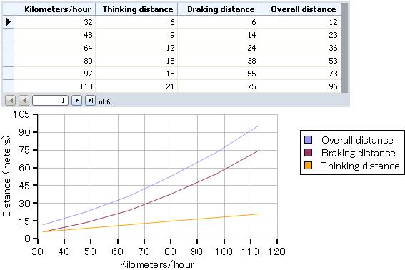
LineLayer は、データ系列の各データ ポイントを結ぶ線を描きます。次の例では、車両速度の関数として典型的な自動車の制動距離をプロットします。例では、以下のデータ系列をプロットしています。
- Thinking distance(空走距離): ドライバーがブレーキを踏むまでの間に走行する距離。
- Braking distance(制動距離): ブレーキを踏んでから車が停止するまでに車が走行する距離。
- Overall distance(停止距離): 車が停止するまでに必要な距離の合計。
折れ線グラフは車両速度の増加による制動距離の増加を明確に表しています。
また、この例では左軸に
axis-label を伴った
ChartAxis を指定しています。軸の既定のラベルはグラフにデータを提供する
RecordSet フィールドの名前かキャプションのリストです。この場合は、キャプションのリストが長すぎて 6cm というグラフの高さに納まらず、グラフが正しく描かれなくなります。指定された軸のラベルならばうまく納まり、より情報量があります。左の
ChartAxis は、停止距離の値を含むソースのレコードセット内のフィールドから構成された
ChartDataSeries に基づいています。停止距離は空走距離と制動距離の合計なので、このフィールドは最適な軸範囲を決定する最も大きな距離の値を含んでいます。グラフ軸の作成についての詳細は、「
LayeredChart 軸」を参照してください。
| 例:
折れ線グラフ |
 |
{import * from CURL.GUI.CHARTS}
{let records:RecordSet =
    {RecordSet
        {RecordFields
            {RecordField "KPH", caption = "Kilometers/hour", domain = int},
            {RecordField "TD", caption = "Thinking distance", domain = int},
            {RecordField "BD", caption = "Braking distance", domain = int},
            {RecordField "OD", caption = "Overall distance", domain = int}
        },
        {RecordData KPH = 32, TD = 6, BD = 6, OD = 12},
        {RecordData KPH = 48, TD = 9, BD = 14, OD = 23},
        {RecordData KPH = 64, TD = 12, BD = 24, OD = 36},
        {RecordData KPH = 80, TD = 15, BD = 38, OD = 53},
        {RecordData KPH = 97, TD = 18, BD = 55, OD = 73},
        {RecordData KPH = 113, TD = 21, BD = 75, OD = 96}
    }
}
{let chart:LayeredChart =
    {LayeredChart
        width = 15cm,
        height = 6cm,
        left-axis =
            {ChartAxis
                {ChartDataSeries records, "OD"},
                axis-label = "Distance (meters)"
            },
        bottom-axis =
            {ChartAxis
                {ChartDataSeries records, "KPH"},
                force-zero? = false
            },
        {LineLayer
            {ChartDataSeries records, "OD"},
            {ChartDataSeries records, "BD"},
            {ChartDataSeries records, "TD"}
        }
    }
}
{VBox
    {RecordGrid
        height = 4cm,
        width = 13cm,
        record-source = records
    },
    chart
}
| |
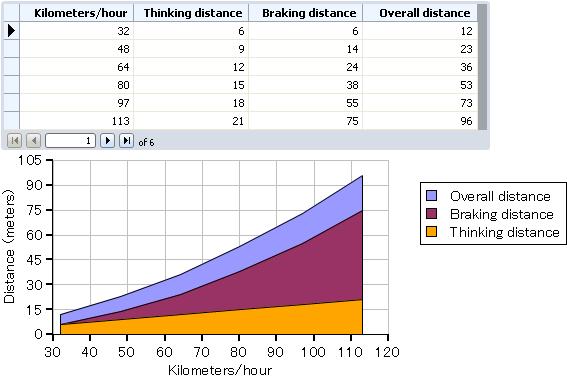
AreaLayer は、各データ値によって形成される線の下の領域を描画します。次の例では、
LineLayer の例と同じデータセットとデータ系列を使用します。線の下の領域を描画することで、
Thinking distance(空走距離) の曲線の形が他とどのように異なるかを強調します。
| 例:
領域グラフ |
 |
{import * from CURL.GUI.CHARTS}

{let records:RecordSet =
    {RecordSet
        {RecordFields
            {RecordField "KPH", caption = "Kilometers/hour", domain = int},
            {RecordField "TD", caption = "Thinking distance", domain = int},
            {RecordField "BD", caption = "Braking distance", domain = int},
            {RecordField "OD", caption = "Overall distance", domain = int}
        },
        {RecordData KPH = 32, TD = 6, BD = 6, OD = 12},
        {RecordData KPH = 48, TD = 9, BD = 14, OD = 23},
        {RecordData KPH = 64, TD = 12, BD = 24, OD = 36},
        {RecordData KPH = 80, TD = 15, BD = 38, OD = 53},
        {RecordData KPH = 97, TD = 18, BD = 55, OD = 73},
        {RecordData KPH = 113, TD = 21, BD = 75, OD = 96}
    }
}
{let chart:LayeredChart =
    {LayeredChart
        width = 15cm,
        height = 6cm,
        left-axis =
            {ChartAxis
                {ChartDataSeries records, "OD"},
                axis-label = "Distance (meters)"
            },
        bottom-axis =
            {ChartAxis
                {ChartDataSeries records, "KPH"},
                force-zero? = false
            },
       {AreaLayer
            {ChartDataSeries records, "OD"},
            {ChartDataSeries records, "BD"},
            {ChartDataSeries records, "TD"}
        }
    }
}
{VBox
    {RecordGrid
        height = 4cm,
        width = 13cm,
        record-source = records
    },
    chart
}
| |
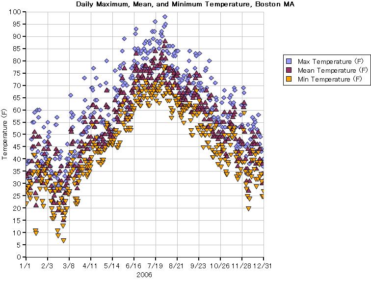
次の例では、散布グラフを使用して、2006年のマサチューセッツ州ボストンでの毎日の最低、最高および平均気温をプロットします。散布図はこの大量のデータを容易に視覚的に分析できるように表示しています。
| 例:
散布グラフ |
 |
{import * from CURL.GUI.CHARTS}
{let boston-temp:CsvRecordSet =
    {CsvRecordSet
        {url "../../default/support/boston-temp.csv"},
        fields =
            {RecordFields
                {RecordField "EST", domain = {StandardDateDomain}},
                {RecordField "MaxT-F", caption = "Max Temperature (F)", domain = int},
                {RecordField "MeanT-F", caption = "Mean Temperature (F)", domain = int},
                {RecordField "MinT-F", caption = "Min Temperature (F)", domain = int}
            }
    }
}
{let chart:LayeredChart =
    {LayeredChart
        width = 20cm,
        height = 15cm,
        bottom-axis-parent =
            {ShapeGroup
                tick-label-rotation = 0deg,
                tick-label-factory =
                    {proc {axis:ChartAxis, tick:ChartTick, tick-rotation:Angle}:any
                        {return
                            {format "%d/%d", tick.value.info.month, tick.value.info.day}
                        }
                    }
            },
        bottom-axis =
            {GenericDataSeriesAxis
                {ChartDataSeries boston-temp, "EST"},
                axis-label = "2006"
            },
        left-axis =
            {ChartAxis
                {ChartDataSeries boston-temp, "MaxT-F"},
                {ChartDataSeries boston-temp, "MinT-F"},
                axis-label = "Temperature (F)"
            },
        {ScatterLayer
            {ChartDataSeries boston-temp, "MaxT-F"},
            {ChartDataSeries boston-temp, "MeanT-F"},
            {ChartDataSeries boston-temp, "MinT-F"}
        }
    }
}
{VBox
    halign = "center",
    {bold Daily Maximum, Mean, and Minimum Temperature, Boston MA},
    chart
}
| |
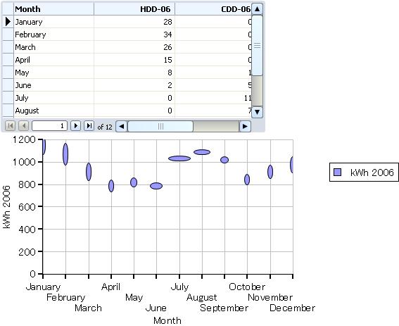
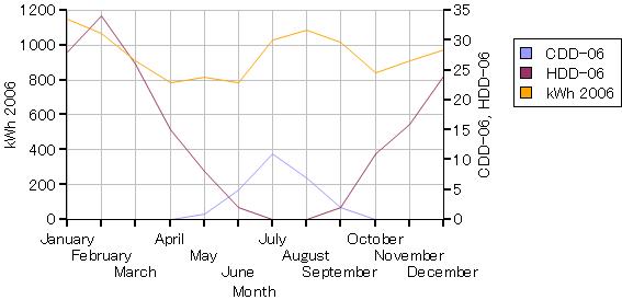
BubbleLayer によってグラフ上のそれぞれの点に付加情報を表示することができます。x 軸および y 軸に関するそれぞれの点の位置は、散布グラフ上での点と同様に、2つのデータ値をプロットします。各点に描画されたシェイプの高さと幅で、追加の2つのデータ値をプロットすることができます。
primary-size-data は各バブルの水平方向を、また
secondary-size-data が垂直方向を決定します。
primary-size-data のみを指定することも可能です。その場合、その値は各バブルのすべての大きさを決定します。
次の例では、2006年の毎月の家庭での電力使用量をプロットしています。x 軸は月、y 軸はキロワット時です。primary-size-data は月の平均的な暖房度日(HDD)、secondary-size-data は冷房度日(CDD)です。暖房度日、および冷房度日は気温に基づいた指数で、暖房と冷房のためのエネルギー需要を反映しています。
secondary-size-data を削除して例を実行してみてください。データのバブルが様々な直径の円になることに注目してください。
| 例:
バブル グラフ |
 |
{import * from CURL.GUI.CHARTS}

{include "../../default/support/electric-use-data.scurl"}

{VBox
    {RecordGrid
        height = 5cm,
        record-source = records
    },
    {LayeredChart
        width = 15cm,
        height = 7.25cm,
        {BubbleLayer
            records,
            "kWh-06",
            scatter-shape = "ellipse",
            x-axis-data =
                {ChartDataSeries records, "Month"},
            primary-size-data =
                {ChartDataSeries records, "CDD-06"},
            secondary-size-data =
                {ChartDataSeries records, "HDD-06"}
        }
    }
}
| |
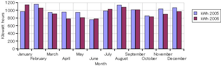
BarLayer は関連データを棒グラフとして表示します。この例ではバブル グラフの例で使用したのと同じレコード セットからのデータをグラフにしています。このグラフでは2005年と2006年の毎月の電力の使用量をプロットしています。グラフでは x 軸に
EnumeratedBarChartAxis を使用しています。この軸は棒グラフに特化されているものです。軸の終わりに目盛をつけ、目盛と目盛の間にデータの点と目盛のラベルを配置します。
| 例:
棒グラフ |
 |
{import * from CURL.GUI.CHARTS}
{include "../../default/support/electric-use-data.scurl"}

{let chart:LayeredChart =
    {LayeredChart
        width = 20cm,
        height = 6cm,
        left-axis =
            {ChartAxis
                {ChartDataSeries records, "kWh-05"},
                axis-label = "Kilowatt hours"
            },
        {BarLayer
            {ChartDataSeries records, "kWh-05"},
            {ChartDataSeries records, "kWh-06"},
            x-axis-data = {ChartDataSeries records, "Month"}
        }
    }
}
{value chart}
| |
| 例:
再構成されたデータとグラフ |
 |
{import * from CURL.GUI.CHARTS}

{let records:RecordSet =
    {RecordSet
        {RecordFields
            {RecordField
                "Region",
                domain = String
            },
            {RecordField "M1", caption = "January", domain = int},
            {RecordField "M2", caption = "February", domain = int},
            {RecordField "M3", caption = "March", domain = int}
        },
        {RecordData Region = "North", M1 = 100, M2 = 140, M3 = 130 },
        {RecordData Region = "East", M1 = 110, M2 = 140, M3 = 170},
        {RecordData Region = "South", M1 = 140, M2 = 100, M3 = 130},
        {RecordData Region = "West", M1 = 160, M2 = 190, M3 = 140}
    }
}
{let chart:LayeredChart =
    {LayeredChart
        width = 10cm,
        height = 6cm,
        {BarLayer
            stacking-mode = ChartStackingMode.stacked,
            {ChartDataSeries records, "M1"},
            {ChartDataSeries records, "M2"},
            {ChartDataSeries records, "M3"},
            x-axis-data = {ChartDataSeries records, "Region"}
        }
    }
}
{VBox
    {RecordGrid height = 4cm, width = 10cm, record-source = records},
    chart
}
| |
| 例:
円グラフ |
 |
{import * from CURL.GUI.CHARTS}
{let records:RecordSet =
{RecordSet
{RecordFields
{RecordField
"Region",
domain = String
},
{RecordField "M1", caption = "January", domain = int}
},
{RecordData Region = "North", M1 = 100},
{RecordData Region = "East", M1 = 110},
{RecordData Region = "South", M1 = 140},
{RecordData Region = "West", M1 = 160}
}
}
{let chart:PieChart =
{PieChart
width = 10cm,
height = 6cm,
{PieSet
{ChartDataSeries records, "M1"},
label-data = {ChartDataSeries records, "Region"}
}
}
}
{VBox
{RecordGrid height = 4cm, width = 10cm, record-source = records},
{Fill height = 1cm},
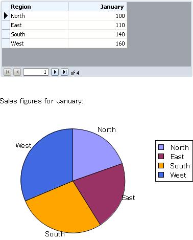
{text Sales figures for January:},
{Fill height = 1cm},
chart
}
| |
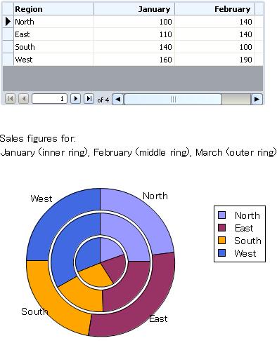
次の例では、2月と3月の売り上げデータの
PieSet を追加します。
| 例:
複数の PieSet のグラフ化 |
 |
{import * from CURL.GUI.CHARTS}
{let records:RecordSet =
    {RecordSet
        {RecordFields
            {RecordField
                "Region",
                domain = String
            },
            {RecordField "M1", caption = "January", domain = int},
            {RecordField "M2", caption = "February", domain = int},
            {RecordField "M3", caption = "March", domain = int}
        },
        {RecordData Region = "North", M1 = 100, M2 = 140, M3 = 130 },
        {RecordData Region = "East", M1 = 110, M2 = 140, M3 = 170},
        {RecordData Region = "South", M1 = 140, M2 = 100, M3 = 130},
        {RecordData Region = "West", M1 = 160, M2 = 190, M3 = 140}
    }
}

{let chart:PieChart =
    {PieChart
        width = 10cm,
        height = 6cm,
        pie-set-inner-margin = 1mm,
        {PieSet {ChartDataSeries records, "M1"}},
        {PieSet {ChartDataSeries records, "M2"}},
        {PieSet
            {ChartDataSeries records, "M3"},
            label-data = {ChartDataSeries records, "Region"}
        }
    }
}
{VBox
    {RecordGrid height = 4cm, width = 10cm, record-source = records},
    {Fill height = 1cm},
    {spaced-vbox
        {text Sales figures for:},
        {text January (inner ring), February (middle ring),
            March (outer ring)}
    },
    {Fill height = 1cm},
    chart
}
| |
Charts API は、
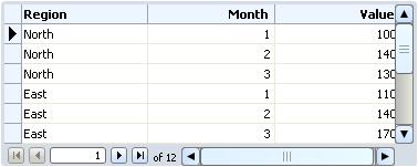
RecordSet のデータをグラフ化します。データはデータベース サーバーから取得されることが多く、通常適切なデータベース設計に基づいた形式で格納されています。この形式は、有用なグラフ作成のためには最適でない場合があります。このセクションでは、効率的で有用なグラフを作成するために、データを最適に構造化する方法について説明します。
たとえば、4 つの地区の第一四半期の売上げデータは、次のようなデータベース構造で格納されています。
| 例:
データベースのデータ構造 |
 |
{let records:RecordSet =
    {RecordSet
        {RecordFields
            {RecordField
                "Region",
                domain = String
            },
            {RecordField
                "Month",
                domain = int
            },
            {RecordField
                "Value",
                domain = int
            }
        },
        {RecordData Region = "North", Month = 1, Value = 100},
        {RecordData Region = "North", Month = 2, Value = 140},
        {RecordData Region = "North", Month = 3, Value = 130},

        {RecordData Region = "East", Month = 1, Value = 110},
        {RecordData Region = "East", Month = 2, Value = 140},
        {RecordData Region = "East", Month = 3, Value = 170},

        {RecordData Region = "South", Month = 1, Value = 140},
        {RecordData Region = "South", Month = 2, Value = 100},
        {RecordData Region = "South", Month = 3, Value = 130},

        {RecordData Region = "West", Month = 1, Value = 160},
        {RecordData Region = "West", Month = 2, Value = 190},
        {RecordData Region = "West", Month = 3, Value = 140}
    }
}
{RecordGrid height = 4cm, width = 10cm, record-source = records}
| |
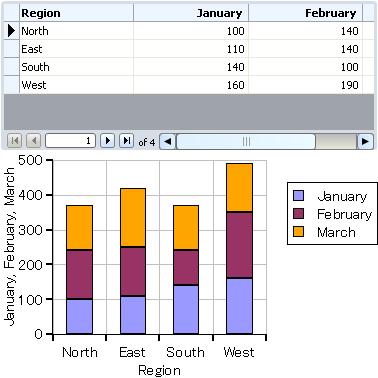
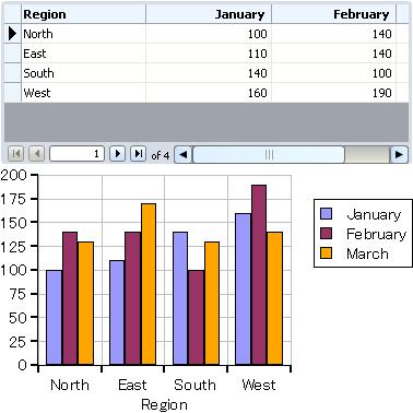
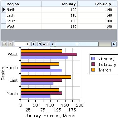
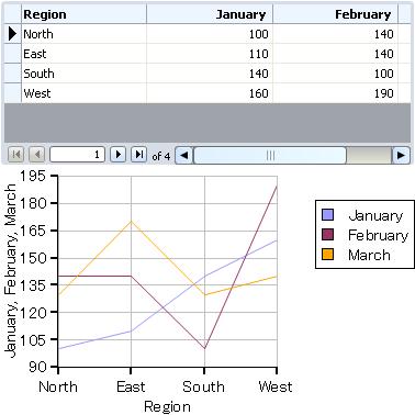
このデータ構造で、すべての地区、すべての月、またはすべての販売価格を表すデータ系列を作成できますが、そのようなデータ系列のグラフはあまり役立ちません。通常必要なのは、1 月のすべての価格、2 月のすべての価格、および 3 月のすべての価格を表すような系列でしょう。次の例で示すようにデータを再構成すると、これを簡単に実現できます。一度データを再構成すると、地域ごとの各月の売上げのグラフを簡単に生成できます。
| 例:
再構成されたデータとグラフ |
 |
{import * from CURL.GUI.CHARTS}

{let records:RecordSet =
    {RecordSet
        {RecordFields
            {RecordField
                "Region",
                domain = String
            },
            {RecordField "M1", caption = "January", domain = int},
            {RecordField "M2", caption = "February", domain = int},
            {RecordField "M3", caption = "March", domain = int}
        },
        {RecordData Region = "North", M1 = 100, M2 = 140, M3 = 130 },
        {RecordData Region = "East", M1 = 110, M2 = 140, M3 = 170},
        {RecordData Region = "South", M1 = 140, M2 = 100, M3 = 130},
        {RecordData Region = "West", M1 = 160, M2 = 190, M3 = 140}
    }
}
{let chart:LayeredChart =
    {LayeredChart
        width = 10cm,
        height = 6cm,
        {BarLayer
            {ChartDataSeries records, "M1"},
            {ChartDataSeries records, "M2"},
            {ChartDataSeries records, "M3"},
            x-axis-data = {ChartDataSeries records, "Region"}
        }
    }
}
{VBox
    {RecordGrid height = 4cm, width = 10cm, record-source = records},
    chart
}
| |
グラフを含むプロジェクトを作成する場合、使用するデータとその構造について慎重に考慮する必要があります。また、そのグラフで実行すべきデータ分析の種類についても考慮する必要があります。そして、グラフの データ元となるレコード セットに必要な構造を決定し、必要な変換を実行するコードを作成します。
次の例では、
DataSeriesAxis と
ChartAxis のサブクラスの相違を示します。最初にロードされるとき、グラフは Y 軸に
NumericAxis-of を使用します。ソース レコード セットでデータ値を変更しても軸は再計算されません。たとえば、地区「South」の「February」の値を 100 から 300 に変更します。軸は変更されず、対応する棒が単純にグラフからはみ出します。
ここで、この行をコメント アウトします。
left-axis = {new {NumericAxis-of double}, 0, 200},
次の各行のコメントを解除します。
left-axis = {new {NumericDataSeriesAxis-of double},
                {ChartDataSeries records, "M2"}
            },
| 例:
DataSeriesAxis と ChartAxisの相違 |
 |
{import * from CURL.GUI.CHARTS}

{let records:RecordSet =
    {RecordSet
        {RecordFields
            {RecordField "Region", domain = String},
            {RecordField "M1", caption = "January", domain = int},
            {RecordField "M2", caption = "February", domain = int},
            {RecordField "M3", caption = "March", domain = int}
        },
        {RecordData Region = "North", M1 = 100, M2 = 140, M3 = 130 },
        {RecordData Region = "East", M1 = 110, M2 = 140, M3 = 170},
        {RecordData Region = "South", M1 = 140, M2 = 100, M3 = 130},
        {RecordData Region = "West", M1 = 160, M2 = 190, M3 = 140}
    }
}
{let chart:LayeredChart =
    {LayeredChart
        width = 10cm,
        height = 6cm,
        left-axis = {new {NumericAxis-of double}, 0, 200},
||--            left-axis = {new {NumericDataSeriesAxis-of double},
||--                            {ChartDataSeries records, "M2"}
||--                        },
        {BarLayer
            {ChartDataSeries records, "M1"},
            {ChartDataSeries records, "M2"},
            {ChartDataSeries records, "M3"},
            x-axis-data = {ChartDataSeries records, "Region"}
        }
    }
}
{VBox
    {RecordGrid height = 4cm, width = 10cm, record-source = records},
    chart
}
| |
| 例:
グラフの軸の配置 |
 |
{import * from CURL.GUI.CHARTS}

{include "../../default/support/electric-use-data.scurl"}

{LayeredChart
    width = 15cm,
    height = 7.25cm,
    left-axis = {ChartAxis
                    {ChartDataSeries records, "kWh-06"}
                },
    right-axis = {ChartAxis
                     {ChartDataSeries records, "CDD-06"},
                     {ChartDataSeries records, "HDD-06"}
                 },
    {LineLayer
        records,
        "kWh-06",
        x-axis-data =
            {ChartDataSeries records, "Month"},
        {ChartDataSeries records, "CDD-06"},
        {ChartDataSeries records, "HDD-06"}
    }
}
| |
| 例:
軸の反転 |
 |
{import * from CURL.GUI.CHARTS}

{let records:RecordSet =
    {RecordSet
        {RecordFields
            {RecordField
                "Region",
                domain = String
            },
            {RecordField "M1", caption = "January", domain = int},
            {RecordField "M2", caption = "February", domain = int},
            {RecordField "M3", caption = "March", domain = int}
        },
        {RecordData Region = "North", M1 = 100, M2 = 140, M3 = 130 },
        {RecordData Region = "East", M1 = 110, M2 = 140, M3 = 170},
        {RecordData Region = "South", M1 = 140, M2 = 100, M3 = 130},
        {RecordData Region = "West", M1 = 160, M2 = 190, M3 = 140}
    }
}
{let chart:LayeredChart =
    {LayeredChart
        width = 10cm,
        height = 6cm,
        flipped? = true,
        {BarLayer
            {ChartDataSeries records, "M1"},
            {ChartDataSeries records, "M2"},
            {ChartDataSeries records, "M3"},
            x-axis-data = {ChartDataSeries records, "Region"}
        }
    }
}
{VBox
    {RecordGrid height = 4cm, width = 10cm, record-source = records},
    chart
}
| |
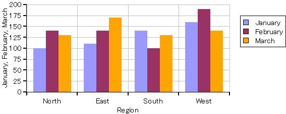
四半期ごとの売り上げサンプルを折れ線グラフにグラフ化する場合、すべての線がグラフの上部にまとまっています。すべてのデータ値が 100 を超えているのに、Y 軸は 0 から 200 までの値を表示するためです。クラス
NumericDataSeriesAxis-of では、グラフの軸に使用される値の範囲を調整できます。既定ではプロパティ
force-zero? は
true で、値
zero がグラフに表示されるよう軸の値を調整します。
force-zero? を
false に設定すると、次の例に示すように、グラフの値が最適に表示されるよう軸が生成されます。
さらに 3 つのプロパティによって、グラフの軸の値の範囲をより制御できるようになります。force-range? が true の場合、グラフは軸の最小値と最大値として forced-min と forced-max を使用します。
次の例でコメント アウトされている 3 つの行は、これらのプロパティを使用して軸の範囲を 80 から 200 に設定しています。コメントを解除して例を実行すると、軸がどのように変化するかを確認できます。
| 例:
軸の範囲の調整 |
 |
{import * from CURL.GUI.CHARTS}

{let records:RecordSet =
    {RecordSet
        {RecordFields
            {RecordField
                "Region",
                domain = String
            },
            {RecordField "M1", caption = "January", domain = int},
            {RecordField "M2", caption = "February", domain = int},
            {RecordField "M3", caption = "March", domain = int}
        },
        {RecordData Region = "North", M1 = 100, M2 = 140, M3 = 130 },
        {RecordData Region = "East", M1 = 110, M2 = 140, M3 = 170},
        {RecordData Region = "South", M1 = 140, M2 = 100, M3 = 130},
        {RecordData Region = "West", M1 = 160, M2 = 190, M3 = 140}
    }
}
{let chart:LayeredChart =
    {LayeredChart
        width = 10cm,
        height = 6cm,
        left-axis = {new {NumericDataSeriesAxis-of double},
                        force-zero? = false,
||--                            force-range? = true,
||--                            forced-min = 80,
||--                            forced-max = 200,
                        {ChartDataSeries records, "M1"},
                        {ChartDataSeries records, "M2"},
                        {ChartDataSeries records, "M3"}
                    },
        {LineLayer
            {ChartDataSeries records, "M1"},
            {ChartDataSeries records, "M2"},
            {ChartDataSeries records, "M3"},
            x-axis-data = {ChartDataSeries records, "Region"}
        }
    }
}
{VBox
    {RecordGrid height = 4cm, width = 10cm, record-source = records},
    chart
}
| |
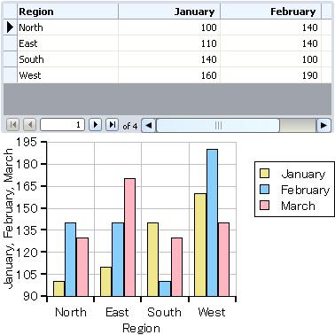
| 例:
パステル カラー パレットの使用 |
 |
{import * from CURL.GUI.CHARTS}

{let records:RecordSet =
    {RecordSet
        {RecordFields
            {RecordField
                "Region",
                domain = String
            },
            {RecordField "M1", caption = "January", domain = int},
            {RecordField "M2", caption = "February", domain = int},
            {RecordField "M3", caption = "March", domain = int}
        },
        {RecordData Region = "North", M1 = 100, M2 = 140, M3 = 130 },
        {RecordData Region = "East", M1 = 110, M2 = 140, M3 = 170},
        {RecordData Region = "South", M1 = 140, M2 = 100, M3 = 130},
        {RecordData Region = "West", M1 = 160, M2 = 190, M3 = 140}
    }
}
{let chart:LayeredChart =
    {LayeredChart
        width = 10cm,
        height = 6cm,
        color-palette = pastel-chart-color-palette,
        left-axis = {new {NumericDataSeriesAxis-of double},
                        force-zero? = false,
                        {ChartDataSeries records, "M1"},
                        {ChartDataSeries records, "M2"},
                        {ChartDataSeries records, "M3"}
                    },
        {BarLayer
            {ChartDataSeries records, "M1"},
            {ChartDataSeries records, "M2"},
            {ChartDataSeries records, "M3"},
            x-axis-data = {ChartDataSeries records, "Region"}
        }
    }
}
{VBox
    {RecordGrid height = 4cm, width = 10cm, record-source = records},
    chart
}
| |
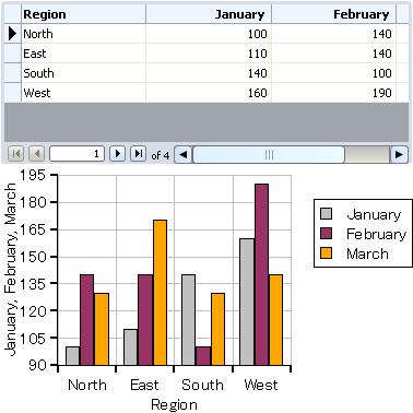
| 例:
色の関連付け |
 |
{import * from CURL.GUI.CHARTS}

{let records:RecordSet =
    {RecordSet
        {RecordFields
            {RecordField
                "Region",
                domain = String
            },
            {RecordField "M1", caption = "January", domain = int},
            {RecordField "M2", caption = "February", domain = int},
            {RecordField "M3", caption = "March", domain = int}
        },
        {RecordData Region = "North", M1 = 100, M2 = 140, M3 = 130 },
        {RecordData Region = "East", M1 = 110, M2 = 140, M3 = 170},
        {RecordData Region = "South", M1 = 140, M2 = 100, M3 = 130},
        {RecordData Region = "West", M1 = 160, M2 = 190, M3 = 140}
    }
}
{let bl:BarLayer =
    {BarLayer
        {ChartDataSeries records, "M1"},
        {ChartDataSeries records, "M2"},
        {ChartDataSeries records, "M3"},
        x-axis-data = {ChartDataSeries records, "Region"}

    }
}
{let chart:LayeredChart =
    {LayeredChart
        width = 10cm,
        height = 6cm,
        left-axis = {new {NumericDataSeriesAxis-of double},
                        force-zero? = false,
                        {ChartDataSeries records, "M1"},
                        {ChartDataSeries records, "M2"},
                        {ChartDataSeries records, "M3"}
                    },
        bl
    }
}
{bl.append-color-association
    {DataSeriesColorPair
        {ChartDataSeries records, "M1"},
        "silver"
    }
}
{VBox
    {RecordGrid height = 4cm, width = 10cm, record-source = records},
    chart
}
| |
Curl の Charts API により、グラフ コンポーネントの生成方法を変更するプロシージャを提供できます。API のマニュアルには、これらの「ファクトリ」について詳細な説明があります。最も重要なのは、次のとおりです。
| 例:
イベントハンドラを追加する shape-factory の使用 |
 |
{import * from CURL.GUI.CHARTS}
{import * from CURL.GRAPHICS.IMAGEFILTER}

{let records:RecordSet =
    {RecordSet
        {RecordFields
            {RecordField
                "Region",
                domain = String
            },
            {RecordField "M1", caption = "January", domain = int},
            {RecordField "M2", caption = "February", domain = int},
            {RecordField "M3", caption = "March", domain = int}
        },
        {RecordData Region = "North", M1 = 100, M2 = 140, M3 = 130 },
        {RecordData Region = "East", M1 = 110, M2 = 140, M3 = 170},
        {RecordData Region = "South", M1 = 140, M2 = 100, M3 = 130},
        {RecordData Region = "West", M1 = 160, M2 = 190, M3 = 140}
    }
}
{let chart:LayeredChart =
    {LayeredChart
        width = 15cm,
        height = 6cm,
        bar-border-width = 0px,
        bottom-axis =
            {EnumeratedBarChartAxis
                {ChartDataSeries records, "Region"}
            },
        {BarLayer
            records,
            "M1",
            "M2",
            "M3",
            shape-factory =
                {proc {layer:BarLayer,
                       rectangle:GRect,
                       record:Record,
                       record-index:int,
                       series-index:int,
                       border-width:any,
                       border-line-style:LineStyle
                      }:Shape
                    let constant stock-shape:Shape =
                        {BarLayer.default-shape-factory
                            layer,
                            rectangle,
                            record,
                            record-index,
                            series-index,
                            border-width,
                            border-line-style
                        }
                    let start-color:FillPattern = FillPattern.white
                    {stock-shape.add-event-handler
                        {on PointerEnter at s:Shape do
                            set start-color = s.color
                            set s.color = {brightness-adjust
                                              start-color, 50%}
                        }
                    }
                    {stock-shape.add-event-handler
                        {on PointerLeave at s:Shape do
                            set s.color = start-color
                        }
                    }
                    {return stock-shape}
                }
        }
    }
}
{value chart}
| |
| 例:
グラフへのシェイプの追加 |
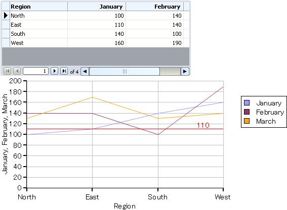 |
{import * from CURL.GUI.CHARTS}
{let records:RecordSet =
    {RecordSet
        {RecordFields
            {RecordField
                "Region",
                domain = String
            },
            {RecordField "M1", caption = "January", domain = int},
            {RecordField "M2", caption = "February", domain = int},
            {RecordField "M3", caption = "March", domain = int}
        },
        {RecordData Region = "North", M1 = 100, M2 = 140, M3 = 130 },
        {RecordData Region = "East", M1 = 110, M2 = 140, M3 = 170},
        {RecordData Region = "South", M1 = 140, M2 = 100, M3 = 130},
        {RecordData Region = "West", M1 = 160, M2 = 190, M3 = 140}
    }
}
{let level-value:double = 110}
{let chart:LayeredChart =
    {LayeredChart
        width = 15cm,
        height = 7cm,
        {LineLayer
            records,
            "M1",
            "M2",
            "M3",
            x-axis-data = {ChartDataSeries records, "Region"},
            {on ChartLayoutChanged at ll:LineLayer do
                let constant y:Distance =
                    {ll.chart.left-axis.get-position level-value}
                {ll.add
                    {RectangleShape
                        {GRect 0m, {ll.chart.get-x-axis-length}, .5pt - y, .5pt + y},
                        color = "red",
                        {TextShape
                            "" & level-value,
                            valign = "bottom",
                            translation =
                                {Distance2d
                                    0.9 * {ll.chart.get-x-axis-length},
                                    y
                                }
                        }
                    }
                }
            }
        }
    }
}
{VBox
    {RecordGrid height = 4cm, width = 10cm, record-source = records},
    chart
}
| |
Copyright © 1998-2019 SCSK Corporation.
All rights reserved.
Curl, the Curl logo, Surge, and the Surge logo are trademarks of SCSK Corporation.
that are registered in the United States. Surge
Lab, the Surge Lab logo, and the Surge Lab Visual Layout Editor (VLE)
logo are trademarks of SCSK Corporation.